Work
Year
Year
2026
2026
Client
Client
Banana Grove
Banana Grove
One ingredient. No compromise.
Duration
Duration
4 months
4 months
Location
Location
Amsterdam, NL
Amsterdam, NL
Industry
Industry
Food & Beverage
Food & Beverage
Deliverables
Deliverables
Brand identity, packaging design, art direction, photography direction, and brand guidelines.
Brand identity, packaging design, art direction, photography direction, and brand guidelines.
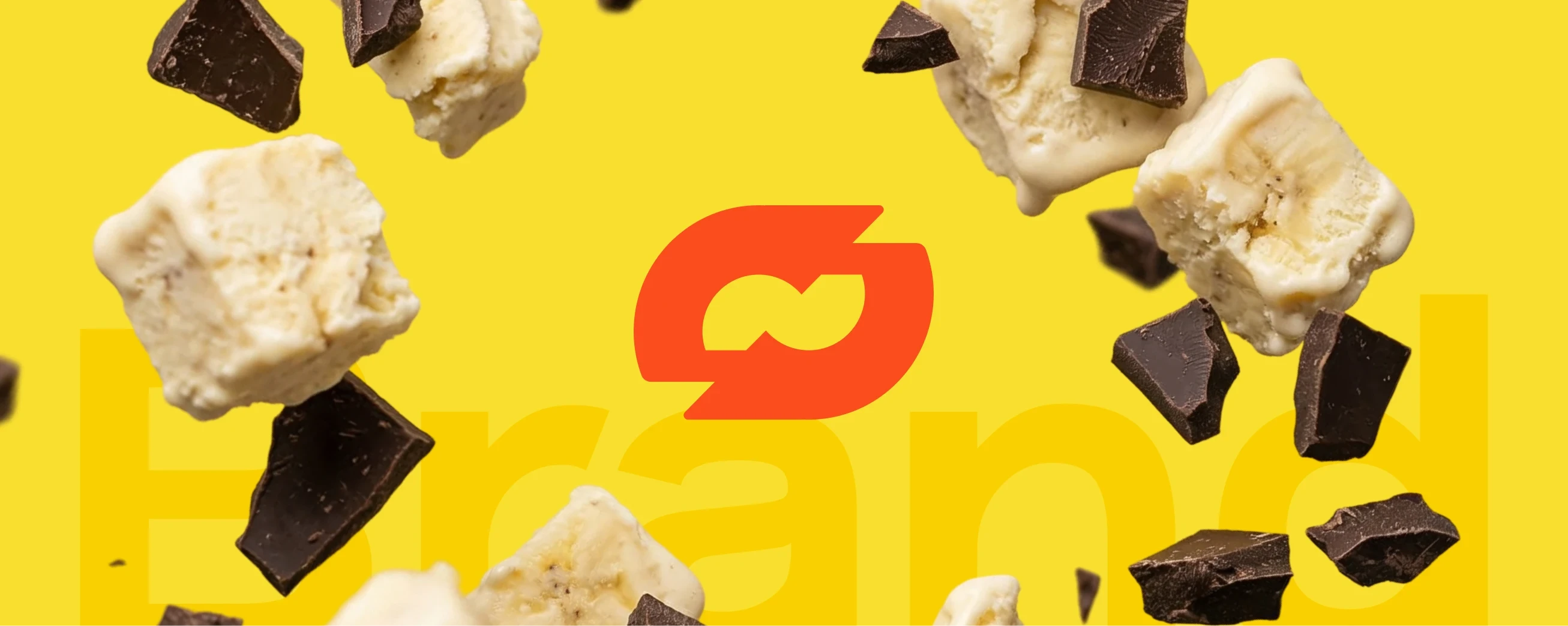
Pure Banana is a premium ice cream brand built on a single ingredient done right. What started as a test batch in a small kitchen became a full brand identity — minimal, confident and entirely dedicated to the idea that one perfect flavor needs nothing to hide behind.
Pure Banana is a premium ice cream brand built on a single ingredient done right. What started as a test batch in a small kitchen became a full brand identity — minimal, confident and entirely dedicated to the idea that one perfect flavor needs nothing to hide behind.
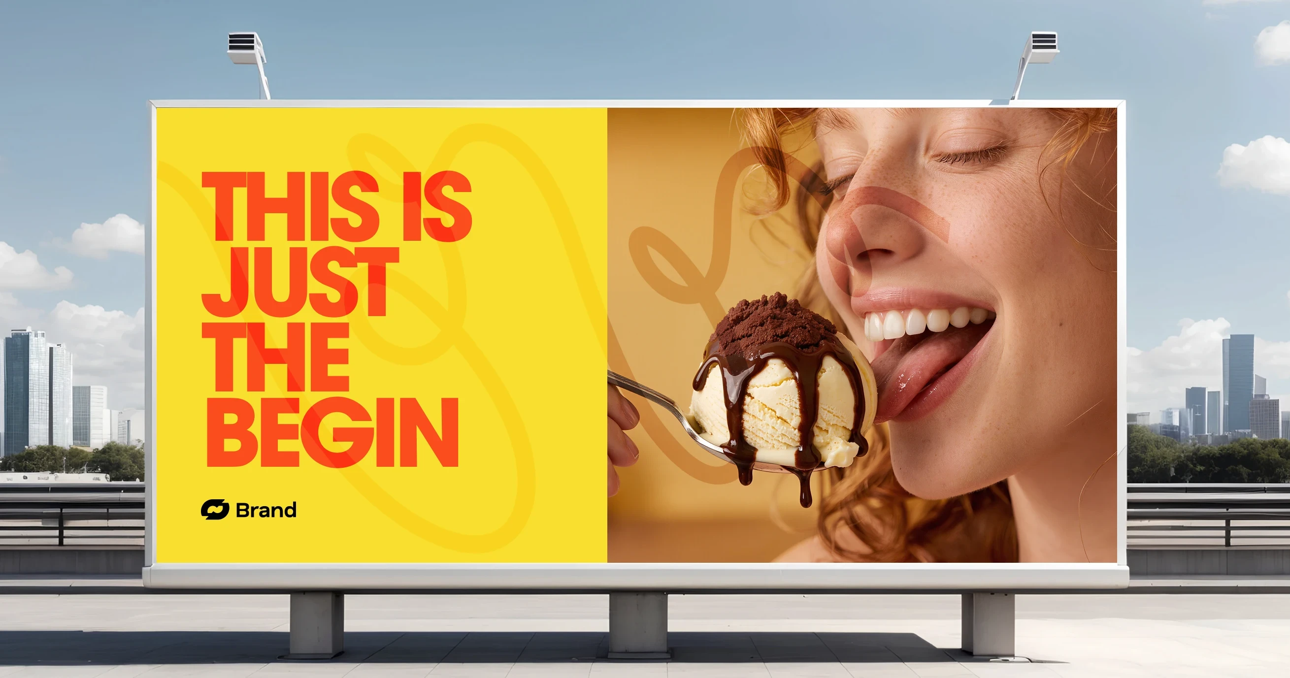
Designing a Premium Ice Cream Brand That Lets the Ingredient Do the Talking
Designing a Premium Ice Cream Brand That Lets the Ingredient Do the Talking
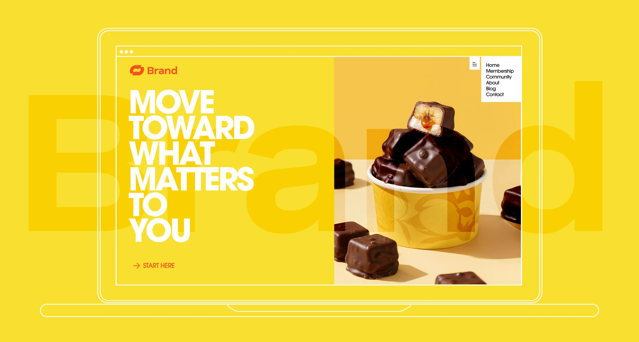
Pure Banana was built on restraint. In a category full of illustrated characters, multicolor containers and flavour overload, the brief was to go in the opposite direction — strip everything back and let the single ingredient carry the entire visual identity. The tub lid became the brand's primary canvas. A clean circular lock-up, two weights of type and a single banana slice as punctuation. Nothing more was needed, because nothing more should be there.
Pure Banana was built on restraint. In a category full of illustrated characters, multicolor containers and flavour overload, the brief was to go in the opposite direction — strip everything back and let the single ingredient carry the entire visual identity. The tub lid became the brand's primary canvas. A clean circular lock-up, two weights of type and a single banana slice as punctuation. Nothing more was needed, because nothing more should be there.
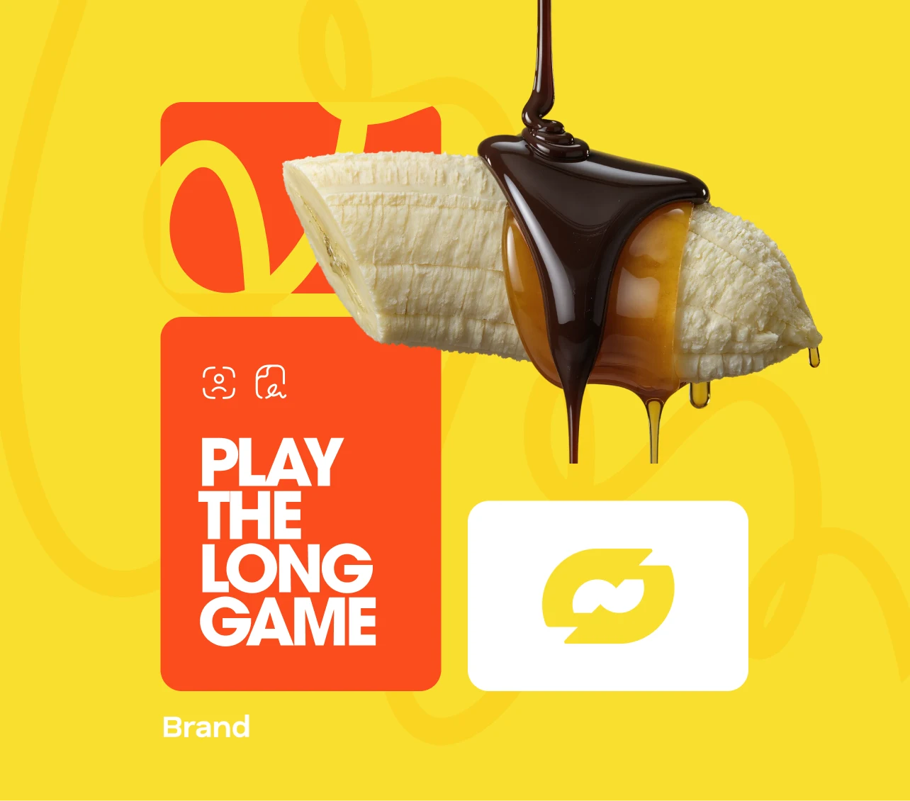
The yellow was not chosen — it was extracted. The exact tone was pulled directly from the skin of a ripe banana at peak ripeness, then matched to a matte finish on the container that absorbs light rather than reflecting it. The result is a packaging that feels warm and edible before you even open it. Brown type on yellow creates a palette that is simultaneously natural and premium. It references the chocolate-dipped banana truffle that comes with each tub, tying the full product experience together through color alone.
The yellow was not chosen — it was extracted. The exact tone was pulled directly from the skin of a ripe banana at peak ripeness, then matched to a matte finish on the container that absorbs light rather than reflecting it. The result is a packaging that feels warm and edible before you even open it. Brown type on yellow creates a palette that is simultaneously natural and premium. It references the chocolate-dipped banana truffle that comes with each tub, tying the full product experience together through color alone.

Building a Visual Language Around Simplicity as a Premium Signal
Building a Visual Language Around Simplicity as a Premium Signal
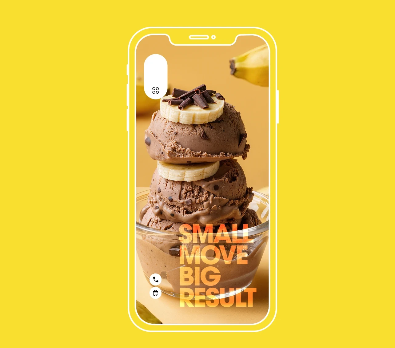
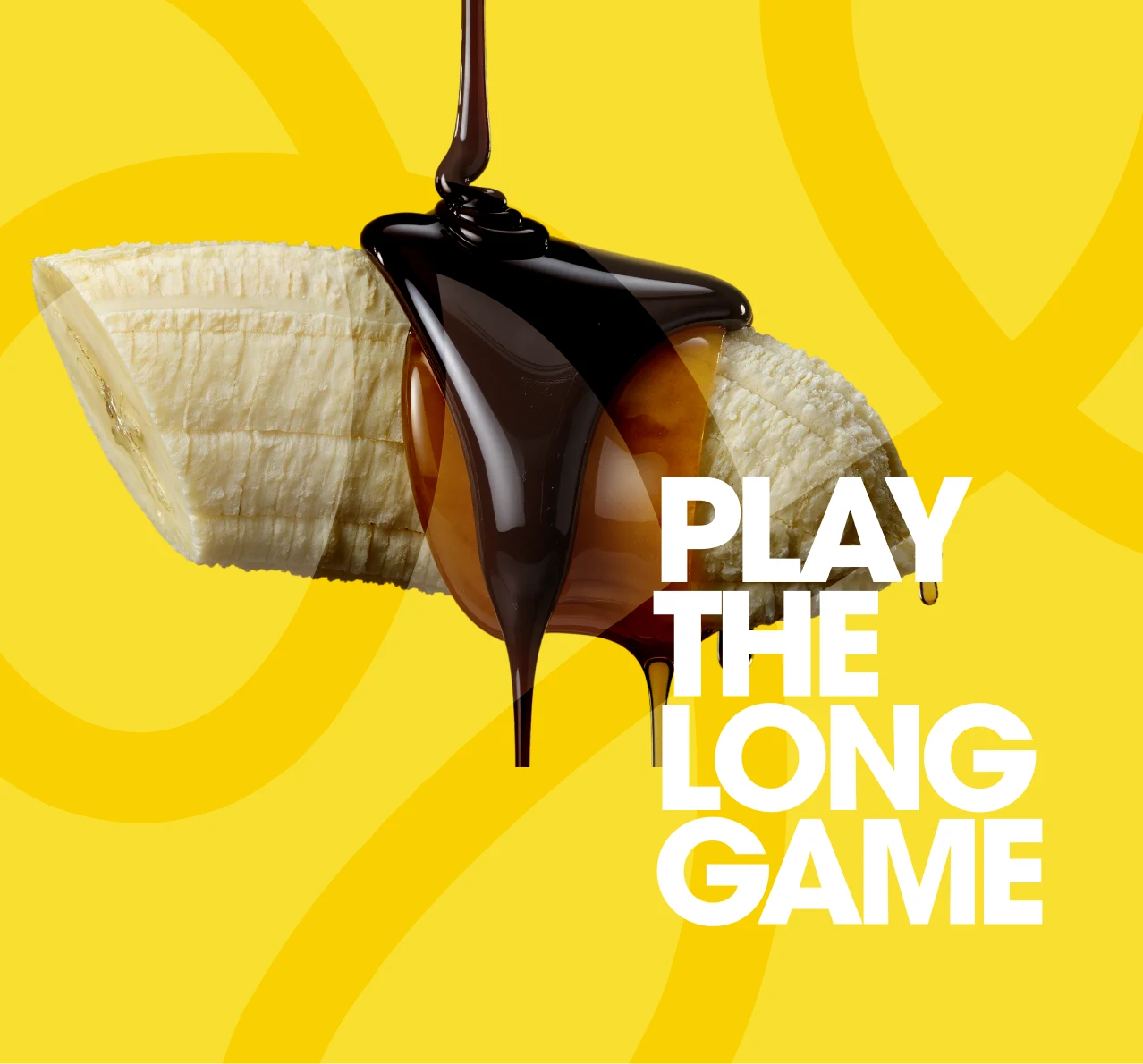
The photography direction was developed to reinforce the single-ingredient commitment. A real banana and a chocolate-coated truffle, placed beside the tub on a flat yellow background — nothing styled, nothing hidden. The composition communicates honesty and confidence in the same frame. This approach was a deliberate counter to the glossy, over-produced aesthetic of most premium ice cream brands. Pure Banana earns its premium positioning not through complexity, but through the clarity of what it is and what it is not.
The photography direction was developed to reinforce the single-ingredient commitment. A real banana and a chocolate-coated truffle, placed beside the tub on a flat yellow background — nothing styled, nothing hidden. The composition communicates honesty and confidence in the same frame. This approach was a deliberate counter to the glossy, over-produced aesthetic of most premium ice cream brands. Pure Banana earns its premium positioning not through complexity, but through the clarity of what it is and what it is not.
The photography direction was developed to reinforce the single-ingredient commitment. A real banana and a chocolate-coated truffle, placed beside the tub on a flat yellow background — nothing styled, nothing hidden. The composition communicates honesty and confidence in the same frame. This approach was a deliberate counter to the glossy, over-produced aesthetic of most premium ice cream brands. Pure Banana earns its premium positioning not through complexity, but through the clarity of what it is and what it is not.
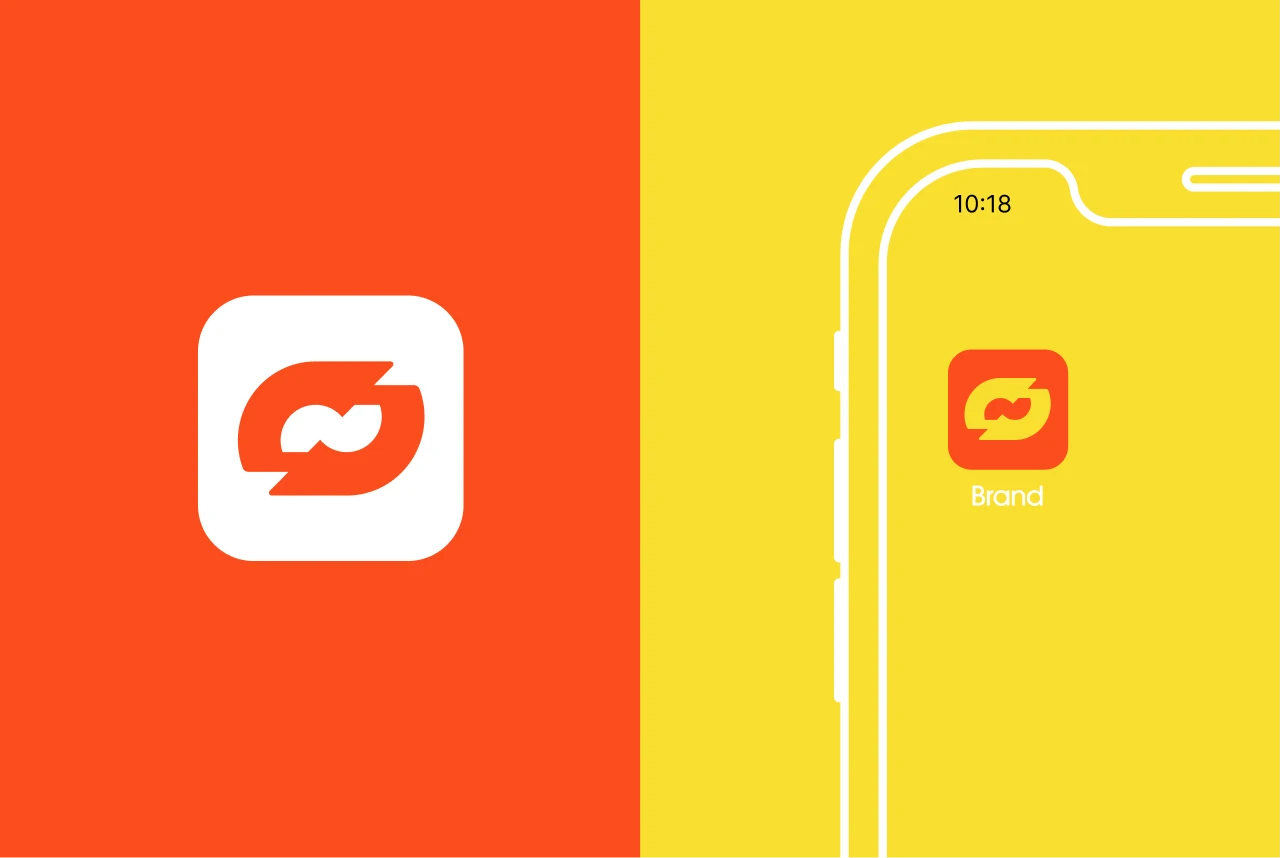
Typography was set in a condensed grotesque with two distinct weights — the word PURE in a heavier cut, BANANA slightly lighter — creating a visual rhythm that makes the name feel like a statement rather than just a label. The banana slice used as a full stop between the two words was the detail that locked the identity together. Small, precise and unexpected, it turns the logo into something you read twice. That double-take is what makes it memorable.
Typography was set in a condensed grotesque with two distinct weights — the word PURE in a heavier cut, BANANA slightly lighter — creating a visual rhythm that makes the name feel like a statement rather than just a label. The banana slice used as a full stop between the two words was the detail that locked the identity together. Small, precise and unexpected, it turns the logo into something you read twice. That double-take is what makes it memorable.
Typography was set in a condensed grotesque with two distinct weights — the word PURE in a heavier cut, BANANA slightly lighter — creating a visual rhythm that makes the name feel like a statement rather than just a label. The banana slice used as a full stop between the two words was the detail that locked the identity together. Small, precise and unexpected, it turns the logo into something you read twice. That double-take is what makes it memorable.
•
Feedback

"Most agencies wanted to add more. More colors, more characters, more everything. This team understood immediately that the whole point was less. The packaging launched in three retailers and we sold out in the first week. People kept the tub after finishing it — that tells you everything."
Nina Brouwer
Founder, Pure Banana Co.
•
Feedback
"Most agencies wanted to add more. More colors, more characters, more everything. This team understood immediately that the whole point was less. The packaging launched in three retailers and we sold out in the first week. People kept the tub after finishing it — that tells you everything."
Nina Brouwer
Founder, Pure Banana Co.
Wanna See More?
Wanna See More?
Wanna See More?