Work
Year
Year
2026
2026
Client
Client
Kryon
Kryon
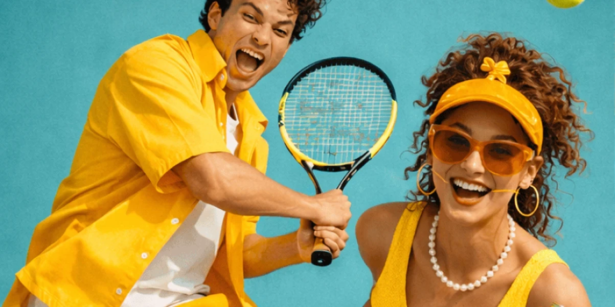
Hold something worth holding.
Duration
Duration
5 months
5 months
Location
Location
Copenhagen, DK
Copenhagen, DK
Industry
Industry
Lifestyle & Consumer Goods
Lifestyle & Consumer Goods
Deliverables
Deliverables
Brand identity, web design, mobile app design, art direction, photography direction, and brand guidelines.
Brand identity, web design, mobile app design, art direction, photography direction, and brand guidelines.
Kryon is a premium reusable drinkware brand designed for people who treat their daily routine as a ritual. What started as a single silicone tumbler in two colors grew into a full web and mobile experience — soft, tactile and built around the idea that the cup you carry says something about who you are.
Kryon is a premium reusable drinkware brand designed for people who treat their daily routine as a ritual. What started as a single silicone tumbler in two colors grew into a full web and mobile experience — soft, tactile and built around the idea that the cup you carry says something about who you are.

Designing a Web and Mobile Experience for a Drinkware Brand Built on Softness and Ritual
Designing a Web and Mobile Experience for a Drinkware Brand Built on Softness and Ritual
Kryon was designed around touch before anything else. The silicone tumbler — matte, seamless and satisfying to hold — is a product that communicates quality through sensation rather than spectacle. The web and mobile experience needed to translate that tactile quality into a screen. The design language was built around softness: rounded corners, generous whitespace, pastel color fields and typography that never raises its voice. Every layout decision was made to feel as calm and considered as the product itself.
Kryon was designed around touch before anything else. The silicone tumbler — matte, seamless and satisfying to hold — is a product that communicates quality through sensation rather than spectacle. The web and mobile experience needed to translate that tactile quality into a screen. The design language was built around softness: rounded corners, generous whitespace, pastel color fields and typography that never raises its voice. Every layout decision was made to feel as calm and considered as the product itself.
The two-color launch strategy — blush pink and sage mint — was treated not as a product variant but as a personality spectrum. Each color targets a slightly different mood and moment, and the website allows users to switch between them in real time, with the entire page environment adapting to match. Photography was shot hands-first. The cups are always held, always close to the body, always in natural light. The images communicate warmth and intimacy — a reminder that this is an object designed to be part of your day, not displayed on a shelf.
The two-color launch strategy — blush pink and sage mint — was treated not as a product variant but as a personality spectrum. Each color targets a slightly different mood and moment, and the website allows users to switch between them in real time, with the entire page environment adapting to match. Photography was shot hands-first. The cups are always held, always close to the body, always in natural light. The images communicate warmth and intimacy — a reminder that this is an object designed to be part of your day, not displayed on a shelf.


Building a Mobile Experience That Turns Product Discovery Into a Sensory Journey
Building a Mobile Experience That Turns Product Discovery Into a Sensory Journey
The mobile app was designed as a companion to the physical product — a space to track hydration, set daily goals and shop new colorways as they launch. The interface mirrors the cup's aesthetic exactly: matte backgrounds, embossed-style UI elements and interactions that feel deliberate and smooth rather than snappy and aggressive. Onboarding was designed around a single question: what does your ideal day feel like? The answer shapes the color recommendation and the hydration rhythm the app suggests. It is a small moment of personalization that makes the product feel like it was made for you specifically.
The mobile app was designed as a companion to the physical product — a space to track hydration, set daily goals and shop new colorways as they launch. The interface mirrors the cup's aesthetic exactly: matte backgrounds, embossed-style UI elements and interactions that feel deliberate and smooth rather than snappy and aggressive. Onboarding was designed around a single question: what does your ideal day feel like? The answer shapes the color recommendation and the hydration rhythm the app suggests. It is a small moment of personalization that makes the product feel like it was made for you specifically.
The mobile app was designed as a companion to the physical product — a space to track hydration, set daily goals and shop new colorways as they launch. The interface mirrors the cup's aesthetic exactly: matte backgrounds, embossed-style UI elements and interactions that feel deliberate and smooth rather than snappy and aggressive. Onboarding was designed around a single question: what does your ideal day feel like? The answer shapes the color recommendation and the hydration rhythm the app suggests. It is a small moment of personalization that makes the product feel like it was made for you specifically.
The embossed logo badge — a circular mark pressed directly into the silicone — became the visual anchor of the digital identity too. It appears as a UI motif across both web and mobile, used as a loader, a section divider and a stamp of authentication on product pages. The color system was extended into the app's notification design. Reminders to drink are delivered in the user's chosen cup color, keeping the brand present throughout the day without ever feeling intrusive. The goal was for Kryon to feel like a habit, not an app.
The embossed logo badge — a circular mark pressed directly into the silicone — became the visual anchor of the digital identity too. It appears as a UI motif across both web and mobile, used as a loader, a section divider and a stamp of authentication on product pages. The color system was extended into the app's notification design. Reminders to drink are delivered in the user's chosen cup color, keeping the brand present throughout the day without ever feeling intrusive. The goal was for Kryon to feel like a habit, not an app.
The embossed logo badge — a circular mark pressed directly into the silicone — became the visual anchor of the digital identity too. It appears as a UI motif across both web and mobile, used as a loader, a section divider and a stamp of authentication on product pages. The color system was extended into the app's notification design. Reminders to drink are delivered in the user's chosen cup color, keeping the brand present throughout the day without ever feeling intrusive. The goal was for Kryon to feel like a habit, not an app.

•
Feedback

"The team understood immediately that our product is about feeling, not features. The website makes people want to pick up the cup before they even read a word. The mobile app turned a simple drinkware purchase into something customers actually come back to every day. We couldn't have asked for more."
Astrid Møller
Co-founder, Kryon
•
Feedback
"The team understood immediately that our product is about feeling, not features. The website makes people want to pick up the cup before they even read a word. The mobile app turned a simple drinkware purchase into something customers actually come back to every day. We couldn't have asked for more."
Astrid Møller
Co-founder, Kryon
Wanna See More?
Wanna See More?
Wanna See More?