Work
Year
Year
2026
2026
Client
Client
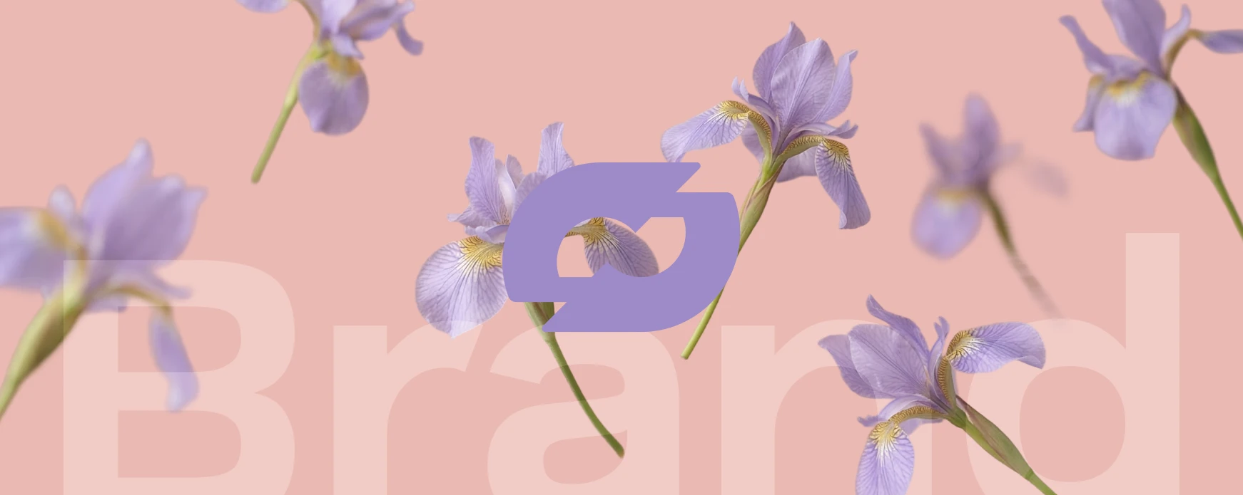
Iris Maison
Iris Maison
A fragrance shaped by nature.
Duration
Duration
4 months
4 months
Location
Location
São Paulo, BR
São Paulo, BR
Industry
Industry
Beauty & Fragrance
Beauty & Fragrance
Deliverables
Deliverables
Brand identity, packaging design, visual direction, product photography, campaign creative, and brand guidelines.
Brand identity, packaging design, visual direction, product photography, campaign creative, and brand guidelines.
Iris Maison is a fragrance brand built around the idea that scent should feel as natural as the memories it evokes. Inspired by quiet moments in nature, the brand combines delicate floral compositions with a calm, modern visual language.
Iris Maison is a fragrance brand built around the idea that scent should feel as natural as the memories it evokes. Inspired by quiet moments in nature, the brand combines delicate floral compositions with a calm, modern visual language.
Iris Maison started with a simple premise
Iris Maison started with a simple premise
Iris Maison started with a simple premise: fragrance should feel calm, personal and grounded in nature. Many modern perfume brands lean heavily on glamour and excess, but Iris Maison aimed for the opposite — quiet sophistication. The identity was designed to mirror the structure of the scent itself. Soft colors, natural materials and minimal forms create a visual environment where the product feels balanced and timeless rather than decorative.
Iris Maison started with a simple premise: fragrance should feel calm, personal and grounded in nature. Many modern perfume brands lean heavily on glamour and excess, but Iris Maison aimed for the opposite — quiet sophistication. The identity was designed to mirror the structure of the scent itself. Soft colors, natural materials and minimal forms create a visual environment where the product feels balanced and timeless rather than decorative.
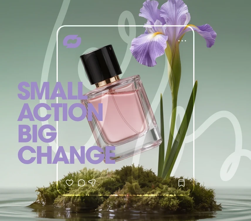
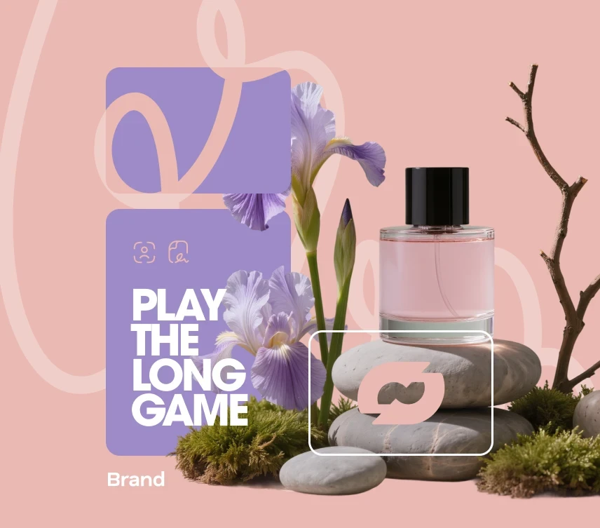
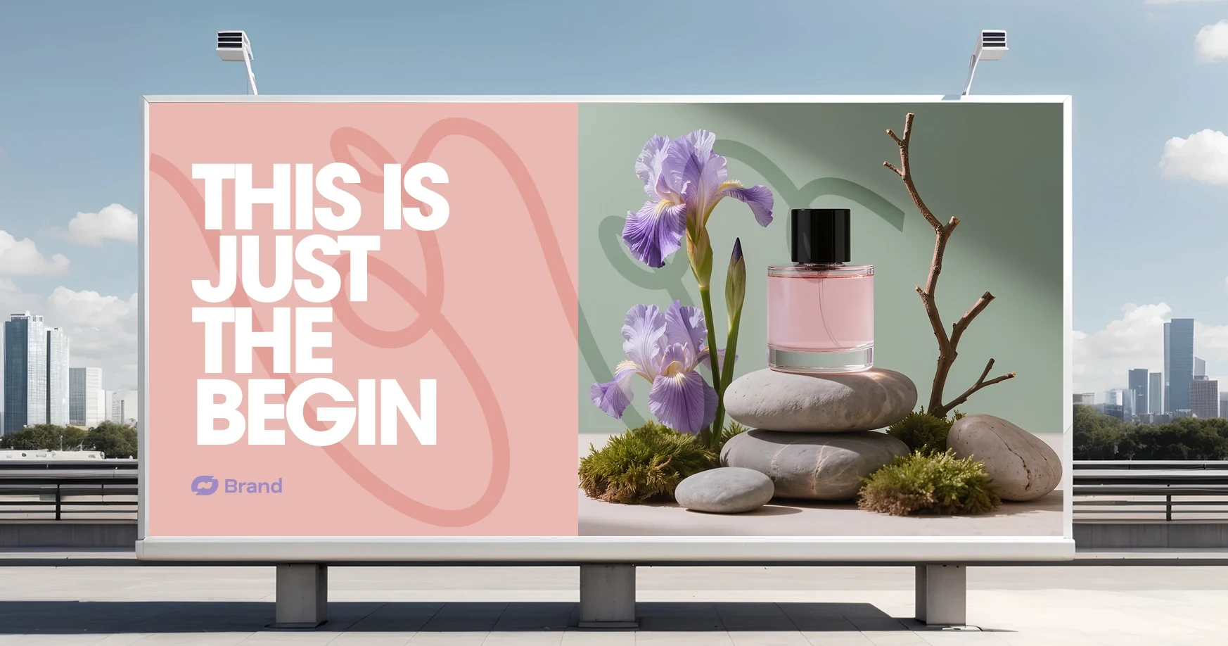
Natural elements became the core of the visual storytelling. Stones, branches and delicate flowers create compositions that feel almost meditative, giving the fragrance a sense of calm presence. Rather than focusing on luxury through gold and ornament, the design highlights texture, balance and light. The result is a brand that feels refined without being distant — a fragrance designed for everyday rituals rather than rare occasions.
Natural elements became the core of the visual storytelling. Stones, branches and delicate flowers create compositions that feel almost meditative, giving the fragrance a sense of calm presence. Rather than focusing on luxury through gold and ornament, the design highlights texture, balance and light. The result is a brand that feels refined without being distant — a fragrance designed for everyday rituals rather than rare occasions.
Designing a Fragrance Brand Inspired by Natural Balance
Designing a Fragrance Brand Inspired by Natural Balance
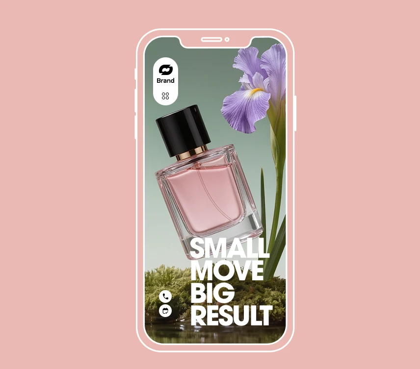
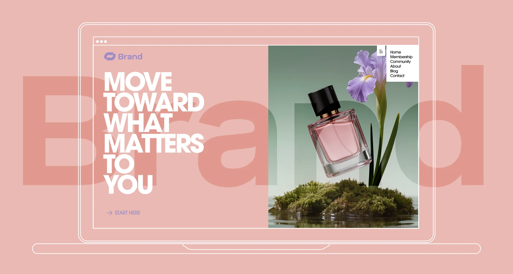
The identity system was built around softness and clarity. The typography is simple and confident, allowing the photography and product form to carry the emotional tone of the brand. Product imagery focuses on still-life compositions inspired by nature — stones, moss and flowers arranged in calm, sculptural environments. This approach creates a visual language that feels timeless and quietly expressive.
The identity system was built around softness and clarity. The typography is simple and confident, allowing the photography and product form to carry the emotional tone of the brand. Product imagery focuses on still-life compositions inspired by nature — stones, moss and flowers arranged in calm, sculptural environments. This approach creates a visual language that feels timeless and quietly expressive.
The identity system was built around softness and clarity. The typography is simple and confident, allowing the photography and product form to carry the emotional tone of the brand. Product imagery focuses on still-life compositions inspired by nature — stones, moss and flowers arranged in calm, sculptural environments. This approach creates a visual language that feels timeless and quietly expressive.
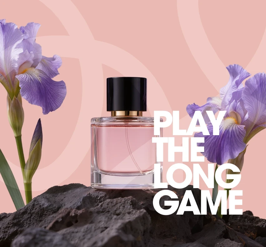
Packaging follows the same philosophy of restraint. Clean glass forms, subtle color palettes and carefully balanced layouts allow the scent itself to remain the hero. Together, these elements create a brand that feels thoughtful and composed. Iris Maison positions fragrance not as an accessory, but as a personal moment — something intimate, calm and lasting.
Packaging follows the same philosophy of restraint. Clean glass forms, subtle color palettes and carefully balanced layouts allow the scent itself to remain the hero. Together, these elements create a brand that feels thoughtful and composed. Iris Maison positions fragrance not as an accessory, but as a personal moment — something intimate, calm and lasting.
Packaging follows the same philosophy of restraint. Clean glass forms, subtle color palettes and carefully balanced layouts allow the scent itself to remain the hero. Together, these elements create a brand that feels thoughtful and composed. Iris Maison positions fragrance not as an accessory, but as a personal moment — something intimate, calm and lasting.
•
Feedback

"Every fintech looks the same. We knew we needed to be different but we didn't know how different until we saw the sticker system. Our merchants started asking for more before we had even launched the campaign. That's when we knew the brand had worked — it became something people wanted to put on their stuff."
Rafael Souza
Head of Brand, VIV Pay
•
Feedback
"Every fintech looks the same. We knew we needed to be different but we didn't know how different until we saw the sticker system. Our merchants started asking for more before we had even launched the campaign. That's when we knew the brand had worked — it became something people wanted to put on their stuff."
Rafael Souza
Head of Brand, VIV Pay
Wanna See More?
Wanna See More?
Wanna See More?