Work
Year
Year
2026
2026
Client
Client
Morning Fold Co.
Morning Fold Co.
Every morning deserves a golden moment.
Duration
Duration
4 months
4 months
Location
Location
Ridgeland, MS
Ridgeland, MS
Industry
Industry
Food & Beverage
Food & Beverage
Deliverables
Deliverables
Brand identity, packaging design, art direction, copywriting, and brand guidelines.
Brand identity, packaging design, art direction, copywriting, and brand guidelines.
Morning Fold is a bakery brand built around the ritual of the morning pastry. What started as a neighborhood concept evolved into a full identity system — packaging, tone of voice and visual language crafted to make every customer feel like the day begins with something worth savoring.
Morning Fold is a bakery brand built around the ritual of the morning pastry. What started as a neighborhood concept evolved into a full identity system — packaging, tone of voice and visual language crafted to make every customer feel like the day begins with something worth savoring.
Designing a Bakery Brand Where Packaging Becomes Part of the Experience
Designing a Bakery Brand Where Packaging Becomes Part of the Experience
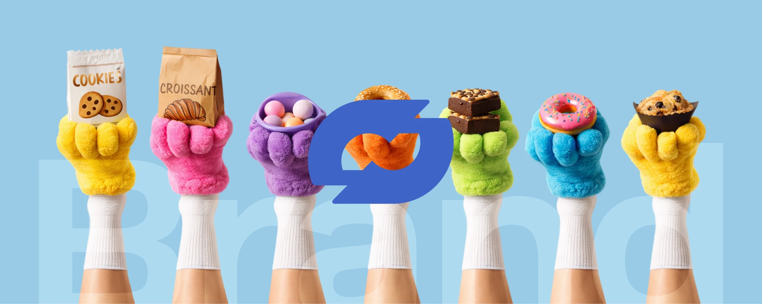
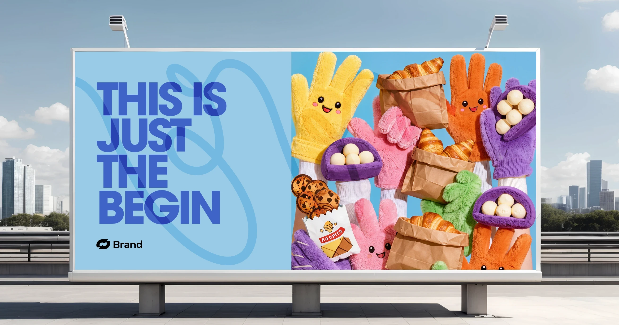
Morning Fold was built on a simple belief: the way a product arrives matters as much as the product itself. The packaging needed to feel warm, playful and immediately recognizable — something you'd want to carry through the street and set on your table before opening. The design system pulled from retro print culture and modern illustration, combining bold type with hand-drawn characters to create a visual personality that feels both nostalgic and current. Every surface of the bag was treated as a canvas.
Morning Fold was built on a simple belief: the way a product arrives matters as much as the product itself. The packaging needed to feel warm, playful and immediately recognizable — something you'd want to carry through the street and set on your table before opening. The design system pulled from retro print culture and modern illustration, combining bold type with hand-drawn characters to create a visual personality that feels both nostalgic and current. Every surface of the bag was treated as a canvas.
The pink and cobalt palette was chosen to break away from the predictable kraft-and-green aesthetic common in artisan bakeries. The goal was contrast — visually loud enough to stand out on a counter, but warm enough to still feel like breakfast. Typography was set in a condensed, confident style that echoes vintage American diner signage. The croissant illustration was drawn with an intentional clumsiness that makes it feel alive, like something sketched with love rather than rendered by machine.
The pink and cobalt palette was chosen to break away from the predictable kraft-and-green aesthetic common in artisan bakeries. The goal was contrast — visually loud enough to stand out on a counter, but warm enough to still feel like breakfast. Typography was set in a condensed, confident style that echoes vintage American diner signage. The croissant illustration was drawn with an intentional clumsiness that makes it feel alive, like something sketched with love rather than rendered by machine.
Turning a Paper Bag Into a Brand Moment Worth Remembering
Turning a Paper Bag Into a Brand Moment Worth Remembering
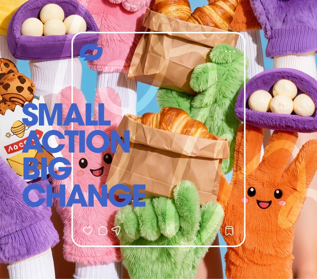
The copy strategy leaned into warmth and rhythm. Phrases like Golden Morning Moments, Pure Dough Love and Bite the Warmth were written to be read aloud — short, musical and easy to remember. The tone sits between friendly neighborhood bakery and confident lifestyle brand. Every message on the packaging was designed to reward attention. Whether someone glances at it on the way out or reads it slowly over coffee, there is always something that feels intentional and considered.
The copy strategy leaned into warmth and rhythm. Phrases like Golden Morning Moments, Pure Dough Love and Bite the Warmth were written to be read aloud — short, musical and easy to remember. The tone sits between friendly neighborhood bakery and confident lifestyle brand. Every message on the packaging was designed to reward attention. Whether someone glances at it on the way out or reads it slowly over coffee, there is always something that feels intentional and considered.
The copy strategy leaned into warmth and rhythm. Phrases like Golden Morning Moments, Pure Dough Love and Bite the Warmth were written to be read aloud — short, musical and easy to remember. The tone sits between friendly neighborhood bakery and confident lifestyle brand. Every message on the packaging was designed to reward attention. Whether someone glances at it on the way out or reads it slowly over coffee, there is always something that feels intentional and considered.
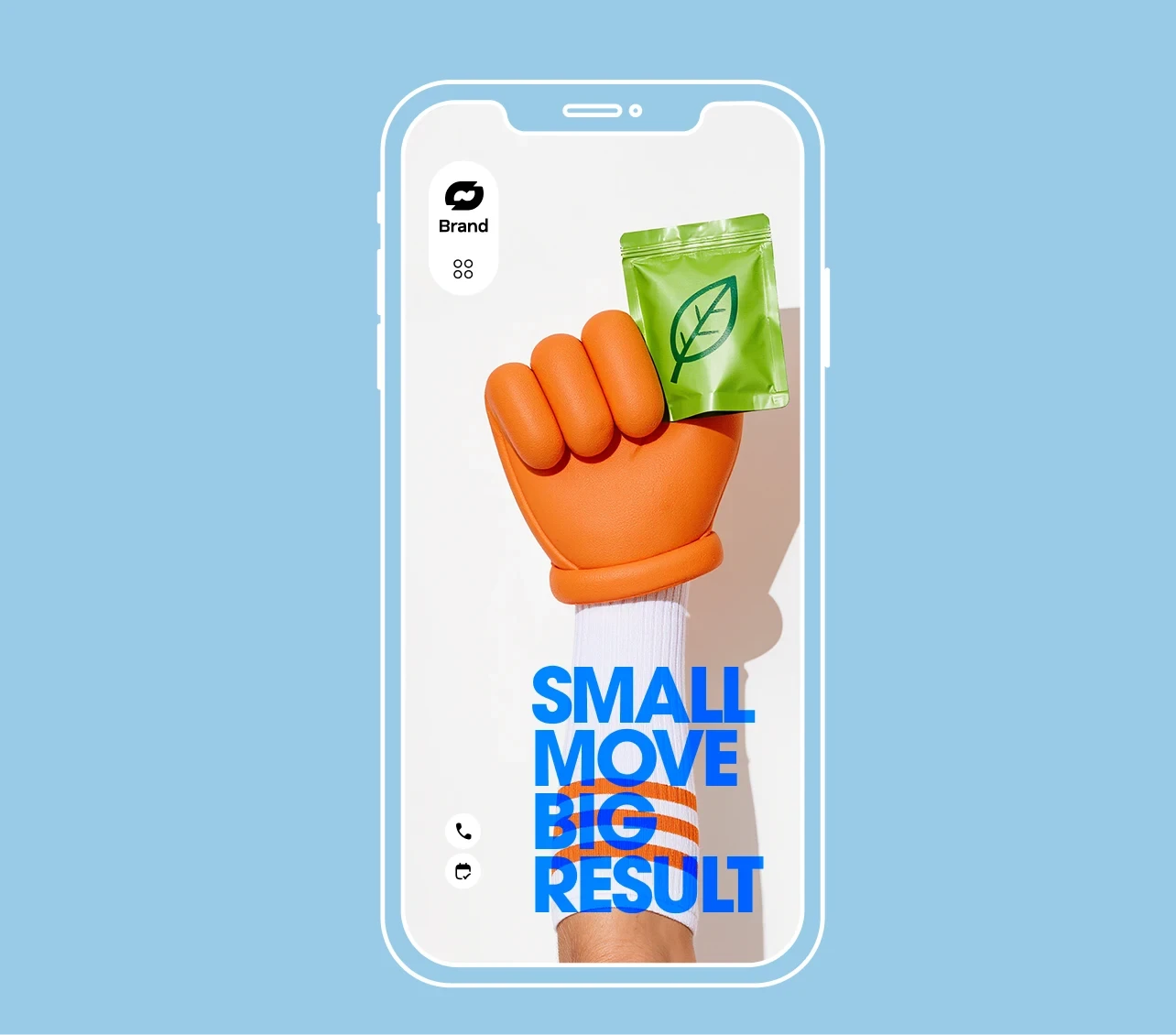
The structure of the bag itself informed the layout. The front face was reserved for the brand mark and hero illustration, while the side panel carried the functional and emotional messaging — Bringing Freshness to Your Table acting almost as a brand promise printed in the margins. This packaging became the brand's primary touchpoint. No storefront signage, no digital campaign could do more than the bag itself traveling through the city in someone's hand.
The structure of the bag itself informed the layout. The front face was reserved for the brand mark and hero illustration, while the side panel carried the functional and emotional messaging — Bringing Freshness to Your Table acting almost as a brand promise printed in the margins. This packaging became the brand's primary touchpoint. No storefront signage, no digital campaign could do more than the bag itself traveling through the city in someone's hand.
The structure of the bag itself informed the layout. The front face was reserved for the brand mark and hero illustration, while the side panel carried the functional and emotional messaging — Bringing Freshness to Your Table acting almost as a brand promise printed in the margins. This packaging became the brand's primary touchpoint. No storefront signage, no digital campaign could do more than the bag itself traveling through the city in someone's hand.
•
Feedback

“Working with them was a great experience from the very beginning. The process was clear, communication was easy, and the final result exceeded our expectations in every way.”
Sofia Mendes
Founder, Morning Fold Co.
“Working with them was a great experience from the very beginning. The process was clear, communication was easy, and the final result exceeded our expectations in every way.”
Sofia Mendes
Founder, Morning Fold Co.
•
Feedback
“Working with them was a great experience from the very beginning. The process was clear, communication was easy, and the final result exceeded our expectations in every way.”
Sofia Mendes
Founder, Morning Fold Co.
Wanna See More?
Wanna See More?
Wanna See More?