Work
Year
Year
2026
2026
Client
Client
Crimson Mode
Crimson Mode
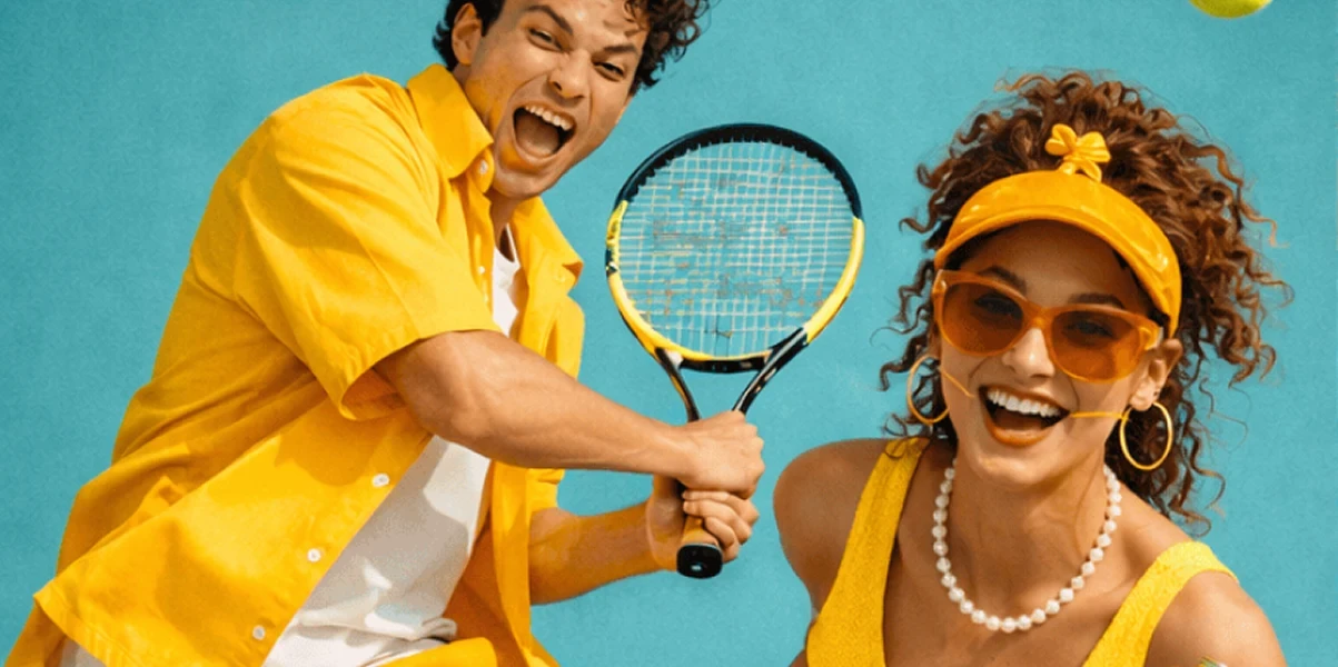
One tone. Every statement.
Duration
Duration
5 months
5 months
Location
Location
Paris, FR
Paris, FR
Industry
Industry
Fashion & Luxury
Fashion & Luxury
Deliverables
Deliverables
Brand identity, web design, art direction, photography direction, campaign creative, and brand guidelines.
Brand identity, web design, art direction, photography direction, campaign creative, and brand guidelines.
Crimson Mode is a contemporary fashion brand built around the conviction that accessories should do more than complete an outfit. What started as a tonal leather collection evolved into a full website and editorial identity — architectural, monochromatic and designed for a customer who dresses with intention.
Crimson Mode is a contemporary fashion brand built around the conviction that accessories should do more than complete an outfit. What started as a tonal leather collection evolved into a full website and editorial identity — architectural, monochromatic and designed for a customer who dresses with intention.

Designing a Fashion Website Where Monochrome Becomes the Most Powerful Creative Statement
Designing a Fashion Website Where Monochrome Becomes the Most Powerful Creative Statement
Crimson Mode was built on the discipline of restraint. The collection — boots and bag shot in the same muted taupe, styled together as a single sculptural object — demanded a website that matched that level of editorial control. Nothing loud, nothing decorative. Only product, proportion and silence. The web design was structured around full-bleed campaign imagery with typographic interventions that never compete with the photography. The grid is wide, the whitespace is deliberate and every page transition was designed to feel like turning the page of a print magazine.
Crimson Mode was built on the discipline of restraint. The collection — boots and bag shot in the same muted taupe, styled together as a single sculptural object — demanded a website that matched that level of editorial control. Nothing loud, nothing decorative. Only product, proportion and silence. The web design was structured around full-bleed campaign imagery with typographic interventions that never compete with the photography. The grid is wide, the whitespace is deliberate and every page transition was designed to feel like turning the page of a print magazine.
The taupe palette — extracted directly from the leather — runs across the entire digital environment. Background tones, UI elements and hover states all reference the same color family, creating a website that feels like it was cut from the same material as the product it sells. The campaign photograph — a leg raised mid-air, boot heel balancing the structured bag — was art directed to function as both editorial image and brand statement. The gesture is confident, slightly surreal and entirely intentional. It communicates the Crimson Mode customer before a single product description is read.
The taupe palette — extracted directly from the leather — runs across the entire digital environment. Background tones, UI elements and hover states all reference the same color family, creating a website that feels like it was cut from the same material as the product it sells. The campaign photograph — a leg raised mid-air, boot heel balancing the structured bag — was art directed to function as both editorial image and brand statement. The gesture is confident, slightly surreal and entirely intentional. It communicates the Crimson Mode customer before a single product description is read.


Building a Product Architecture That Treats Every Accessory as a Sculptural Object
Building a Product Architecture That Treats Every Accessory as a Sculptural Object
The product pages were designed to give each piece room to exist as an object rather than a listing. Imagery is large, transitions are slow and the technical details — leather grade, sole construction, interior lining — are presented with the same typographic weight as the product name itself. Nothing is buried in a tab. The tonal photography treatment was extended across all product shots: same background tone, same lighting angle, same shadow depth. The consistency transforms the catalogue into a collection — a body of work rather than an inventory.
The product pages were designed to give each piece room to exist as an object rather than a listing. Imagery is large, transitions are slow and the technical details — leather grade, sole construction, interior lining — are presented with the same typographic weight as the product name itself. Nothing is buried in a tab. The tonal photography treatment was extended across all product shots: same background tone, same lighting angle, same shadow depth. The consistency transforms the catalogue into a collection — a body of work rather than an inventory.
The product pages were designed to give each piece room to exist as an object rather than a listing. Imagery is large, transitions are slow and the technical details — leather grade, sole construction, interior lining — are presented with the same typographic weight as the product name itself. Nothing is buried in a tab. The tonal photography treatment was extended across all product shots: same background tone, same lighting angle, same shadow depth. The consistency transforms the catalogue into a collection — a body of work rather than an inventory.
The bag and boot were photographed together as a deliberate pairing, introducing the concept of the Crimson Mode set — two pieces designed to be worn as one system. This logic was built into the website's product architecture, with cross-sell modules that show complementary pieces rather than random recommendations. Navigation was stripped to four items. The mobile experience mirrors the desktop with no compromise — the same editorial weight, the same image scale, the same unhurried pace. Crimson Mode does not adapt to the phone screen. The phone screen adapts to Crimson Mode.
The bag and boot were photographed together as a deliberate pairing, introducing the concept of the Crimson Mode set — two pieces designed to be worn as one system. This logic was built into the website's product architecture, with cross-sell modules that show complementary pieces rather than random recommendations. Navigation was stripped to four items. The mobile experience mirrors the desktop with no compromise — the same editorial weight, the same image scale, the same unhurried pace. Crimson Mode does not adapt to the phone screen. The phone screen adapts to Crimson Mode.
The bag and boot were photographed together as a deliberate pairing, introducing the concept of the Crimson Mode set — two pieces designed to be worn as one system. This logic was built into the website's product architecture, with cross-sell modules that show complementary pieces rather than random recommendations. Navigation was stripped to four items. The mobile experience mirrors the desktop with no compromise — the same editorial weight, the same image scale, the same unhurried pace. Crimson Mode does not adapt to the phone screen. The phone screen adapts to Crimson Mode.

•
Feedback

"We wanted the website to feel like a showroom, not a shop. The team delivered exactly that. The photography direction they developed became our campaign standard — we have used the same visual logic across three seasons now. Customers tell us they buy the pair because the site makes it impossible to imagine one without the other."
Isabelle Moreau
Brand Director, Crimson Mode
•
Feedback
"We wanted the website to feel like a showroom, not a shop. The team delivered exactly that. The photography direction they developed became our campaign standard — we have used the same visual logic across three seasons now. Customers tell us they buy the pair because the site makes it impossible to imagine one without the other."
Isabelle Moreau
Brand Director, Crimson Mode
Wanna See More?
Wanna See More?
Wanna See More?