Work
Year
Year
2026
2026
Client
Client
Lucky Bite
Lucky Bite
Good dog. Better treat.
Duration
Duration
4 months
4 months
Location
Location
Austin, US
Austin, US
Industry
Industry
Pet Food & Wellness
Pet Food & Wellness
Deliverables
Deliverables
Brand identity, packaging design, art direction, photography direction, campaign creative, and brand guidelines.
Brand identity, packaging design, art direction, photography direction, campaign creative, and brand guidelines.
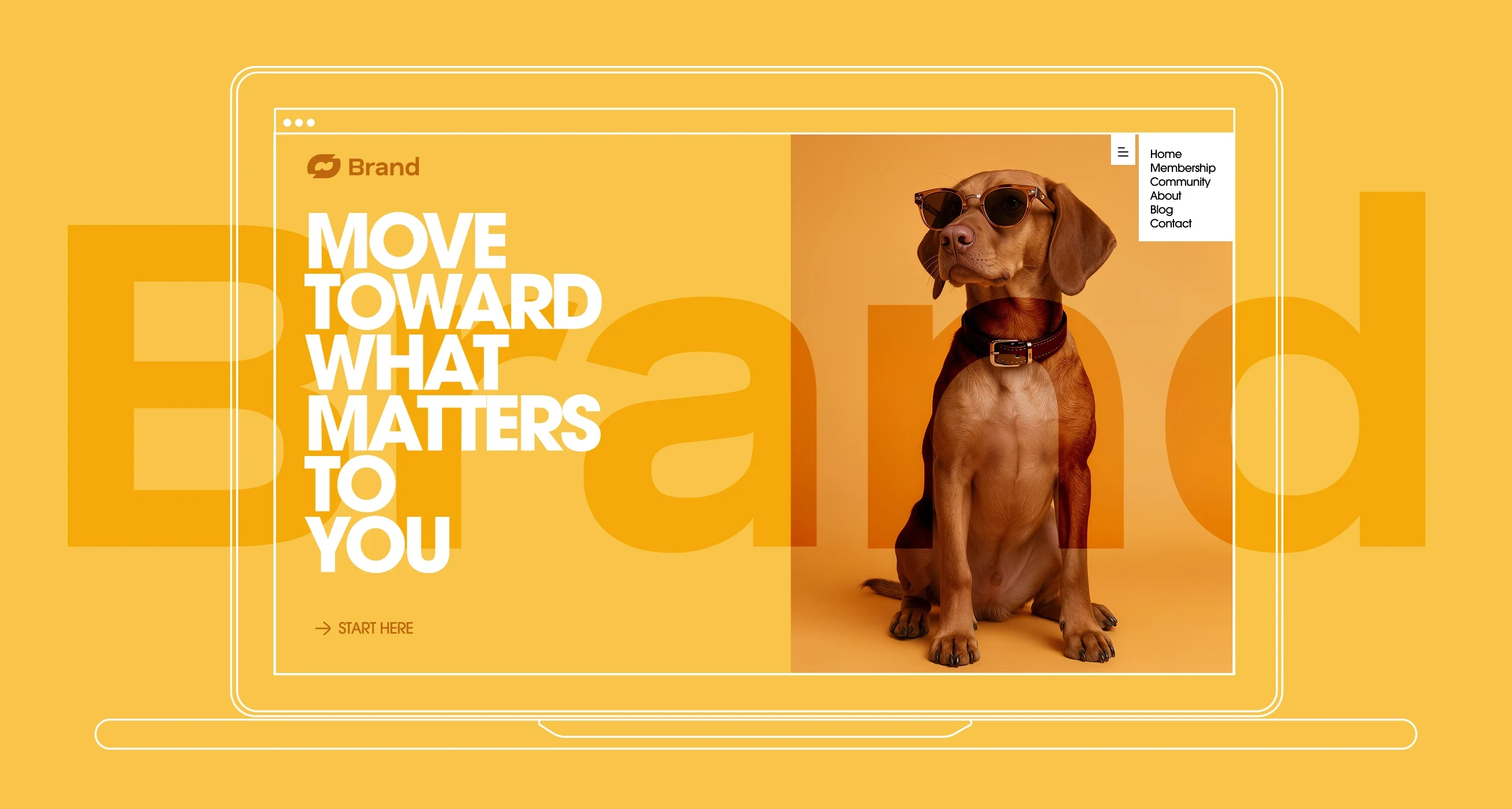
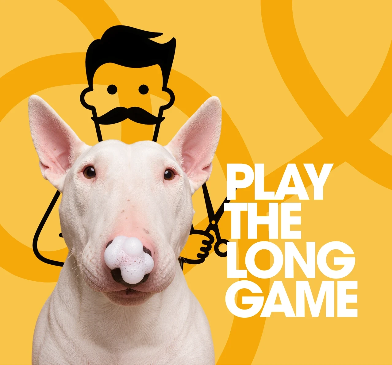
This project focuses on building a bold and adaptable brand identity designed to stand out across both digital and physical environments. By combining strong color, expressive imagery and a clear visual structure, the design creates a cohesive system that feels modern, approachable and instantly recognizable.
This project focuses on building a bold and adaptable brand identity designed to stand out across both digital and physical environments. By combining strong color, expressive imagery and a clear visual structure, the design creates a cohesive system that feels modern, approachable and instantly recognizable.
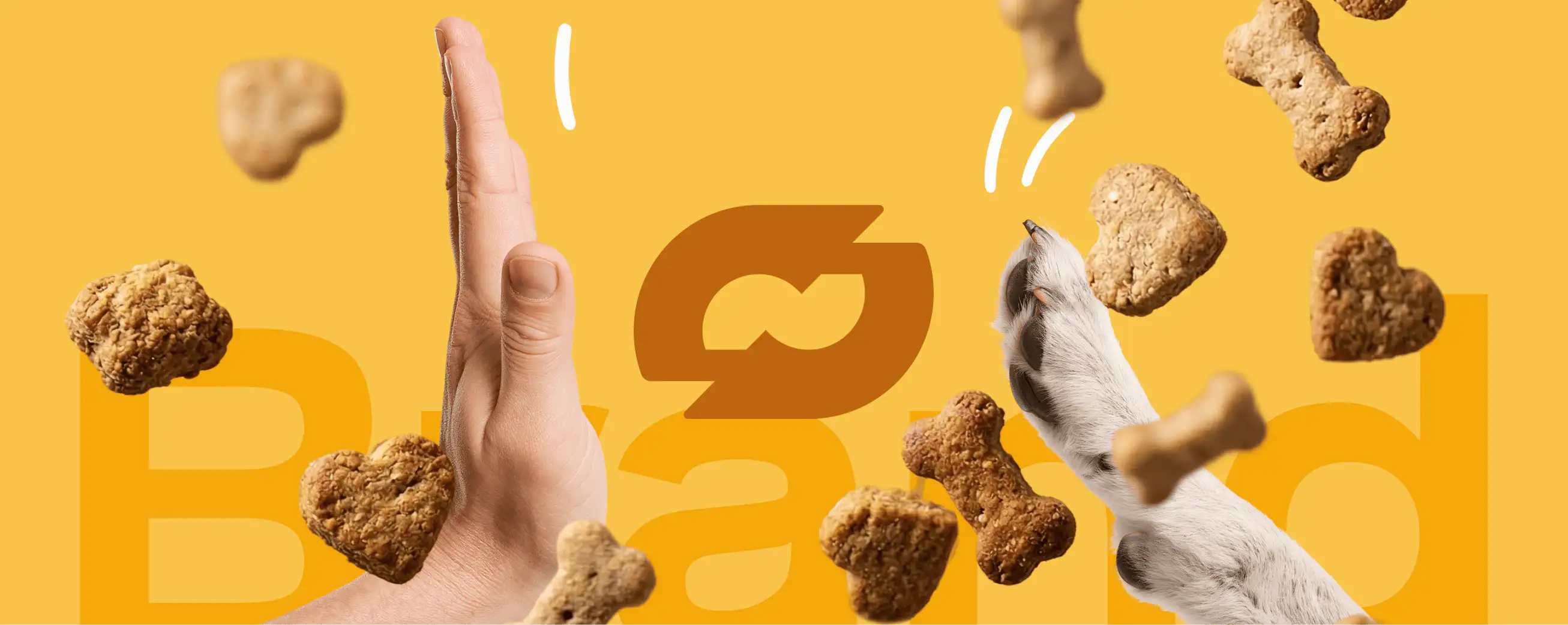
Designing a Dog Treat Brand Where the Campaign Image Does Everything the Copy Doesn't Need To
Designing a Dog Treat Brand Where the Campaign Image Does Everything the Copy Doesn't Need To
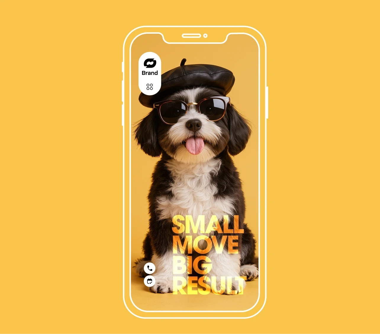
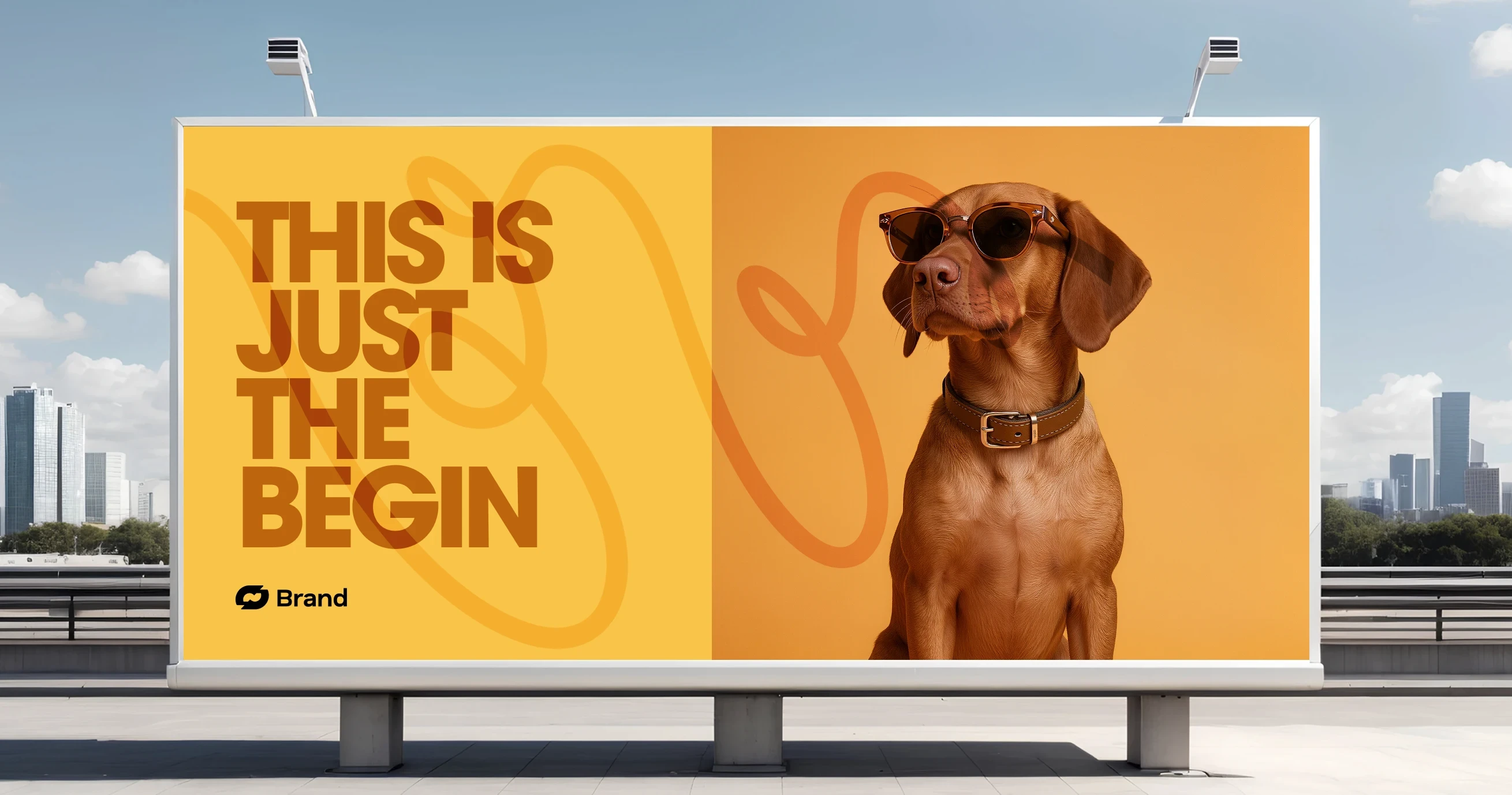
Stackd was built on a single creative bet: that the most powerful thing a dog treat brand could do was show a dog desperately, joyfully, impossibly focused on the treat itself. Not a happy owner. Not a green meadow. Just a dog, a nose pointing skyward and a tower of biscuits defying gravity above it. The brief was to create a brand that pet owners would stop to photograph in a store aisle the same way they stop to photograph their own dogs. The product needed to feel as joyful as the animal it was made for, and the identity needed to carry that energy across every touchpoint.
Stackd was built on a single creative bet: that the most powerful thing a dog treat brand could do was show a dog desperately, joyfully, impossibly focused on the treat itself. Not a happy owner. Not a green meadow. Just a dog, a nose pointing skyward and a tower of biscuits defying gravity above it. The brief was to create a brand that pet owners would stop to photograph in a store aisle the same way they stop to photograph their own dogs. The product needed to feel as joyful as the animal it was made for, and the identity needed to carry that energy across every touchpoint.
The amber yellow was chosen as the brand's primary color for its direct reference to the warm, biscuit-baked tones of the treats themselves — the color of good ingredients cooked at the right temperature. Against it, the dog's tan and white coat almost disappears into the environment, making the treat tower the only thing competing for the eye. The monochromatic effect — dog, treats and background all within the same golden register — was entirely intentional. It creates a visual unity that feels designed rather than photographed, turning a product shot into a brand statement.
The amber yellow was chosen as the brand's primary color for its direct reference to the warm, biscuit-baked tones of the treats themselves — the color of good ingredients cooked at the right temperature. Against it, the dog's tan and white coat almost disappears into the environment, making the treat tower the only thing competing for the eye. The monochromatic effect — dog, treats and background all within the same golden register — was entirely intentional. It creates a visual unity that feels designed rather than photographed, turning a product shot into a brand statement.
Building a Treat Brand That Takes Ingredients Seriously Without Taking Itself Too Seriously
Building a Treat Brand That Takes Ingredients Seriously Without Taking Itself Too Seriously
The packaging system was developed as a direct extension of the campaign photography palette — amber backgrounds, warm cream type and the Stackd wordmark set in a rounded, confident sans that communicates friendliness without infantilizing the product or its buyer. Each SKU in the range was assigned a treat shape as its visual identifier — bone, biscuit, round — printed large on the front panel and used as a graphic device throughout the secondary packaging system. The shapes are functional navigation and playful illustration at the same time.
The packaging system was developed as a direct extension of the campaign photography palette — amber backgrounds, warm cream type and the Stackd wordmark set in a rounded, confident sans that communicates friendliness without infantilizing the product or its buyer. Each SKU in the range was assigned a treat shape as its visual identifier — bone, biscuit, round — printed large on the front panel and used as a graphic device throughout the secondary packaging system. The shapes are functional navigation and playful illustration at the same time.
The packaging system was developed as a direct extension of the campaign photography palette — amber backgrounds, warm cream type and the Stackd wordmark set in a rounded, confident sans that communicates friendliness without infantilizing the product or its buyer. Each SKU in the range was assigned a treat shape as its visual identifier — bone, biscuit, round — printed large on the front panel and used as a graphic device throughout the secondary packaging system. The shapes are functional navigation and playful illustration at the same time.
The stacking concept was carried through the entire brand architecture — from the campaign image to the way products are displayed on shelf, always in a vertical column with the hero treat at the top. The visual language rewards consistency and creates a display presence that is recognizable from the end of a pet store aisle. The brand's tone of voice was written to match the image: dry, warm and very slightly absurd. Product descriptions read like the dog wrote them. Nutritional information is presented with the same care as the copy, because the Stackd customer reads labels and appreciates the honesty.
The stacking concept was carried through the entire brand architecture — from the campaign image to the way products are displayed on shelf, always in a vertical column with the hero treat at the top. The visual language rewards consistency and creates a display presence that is recognizable from the end of a pet store aisle. The brand's tone of voice was written to match the image: dry, warm and very slightly absurd. Product descriptions read like the dog wrote them. Nutritional information is presented with the same care as the copy, because the Stackd customer reads labels and appreciates the honesty.
The stacking concept was carried through the entire brand architecture — from the campaign image to the way products are displayed on shelf, always in a vertical column with the hero treat at the top. The visual language rewards consistency and creates a display presence that is recognizable from the end of a pet store aisle. The brand's tone of voice was written to match the image: dry, warm and very slightly absurd. Product descriptions read like the dog wrote them. Nutritional information is presented with the same care as the copy, because the Stackd customer reads labels and appreciates the honesty.
•
Feedback

"We sent the campaign image to our mailing list before we had even finished the packaging and got seventy pre-orders in two hours. People kept saying their dog did that exact thing. That recognition is everything — it means the brand is already true before the product arrives. The team built something that felt like us from the first presentation and we never looked back."
Tyler Brooks
Founder, Stackd
•
Feedback
"We sent the campaign image to our mailing list before we had even finished the packaging and got seventy pre-orders in two hours. People kept saying their dog did that exact thing. That recognition is everything — it means the brand is already true before the product arrives. The team built something that felt like us from the first presentation and we never looked back."
Tyler Brooks
Founder, Stackd
Wanna See More?
Wanna See More?
Wanna See More?