Work
Year
Year
2023
2023
Client
Client
Nexthor
Nexthor
Show up. Every time.
Duration
Duration
5 months
5 months
Location
Location
London, UK
London, UK
Industry
Industry
Health & Fitness
Health & Fitness
Deliverables
Deliverables
Brand identity, logo design, app design, art direction, photography direction, and brand guidelines.
Brand identity, logo design, app design, art direction, photography direction, and brand guidelines.
Nexthor is a fitness and mindfulness platform connecting people with studios, instructors and classes that match the way they actually want to move. What started as a local studio booking tool evolved into a full brand identity — grounded, energetic and built for the kind of person who shows up consistently rather than occasionally.
Nexthor is a fitness and mindfulness platform connecting people with studios, instructors and classes that match the way they actually want to move. What started as a local studio booking tool evolved into a full brand identity — grounded, energetic and built for the kind of person who shows up consistently rather than occasionally.

Designing a Fitness Platform Identity That Belongs to the Studio Floor, Not the Gym Wall
Designing a Fitness Platform Identity That Belongs to the Studio Floor, Not the Gym Wall
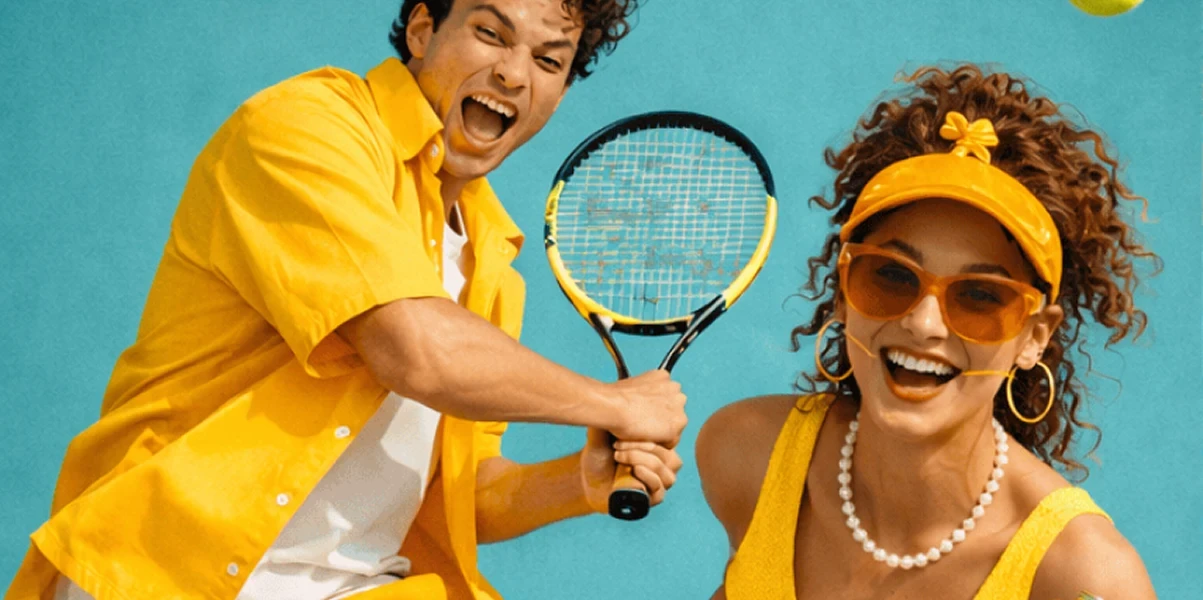
Nexthor was built for a specific kind of fitness culture — one that values presence over performance, consistency over intensity and the shared energy of a room full of people committed to the same hour. The platform connects users with yoga studios, pilates spaces and mindfulness-led movement classes, and the identity needed to reflect that community-first approach. The brief was to build something that felt as at home on a phone screen as it did in the warm light of a hardwood studio floor. An identity that understood the difference between a fitness app and a fitness community.
Nexthor was built for a specific kind of fitness culture — one that values presence over performance, consistency over intensity and the shared energy of a room full of people committed to the same hour. The platform connects users with yoga studios, pilates spaces and mindfulness-led movement classes, and the identity needed to reflect that community-first approach. The brief was to build something that felt as at home on a phone screen as it did in the warm light of a hardwood studio floor. An identity that understood the difference between a fitness app and a fitness community.
The brand mark — a radial burst form contained within a rounded square — was designed to suggest both energy and focus simultaneously. It reads as a sun, a compass and a moment of expansion — three ideas that capture what the best fitness class feels like from the inside. The rounded container softens the directional energy of the burst, keeping the mark approachable rather than aggressive. The red accent — used as a single, precise detail in the logo and across key UI moments — introduces urgency without anxiety. It is the color of a class about to begin, not a heart rate monitor in the red zone. Small, intentional and impossible to miss.
The brand mark — a radial burst form contained within a rounded square — was designed to suggest both energy and focus simultaneously. It reads as a sun, a compass and a moment of expansion — three ideas that capture what the best fitness class feels like from the inside. The rounded container softens the directional energy of the burst, keeping the mark approachable rather than aggressive. The red accent — used as a single, precise detail in the logo and across key UI moments — introduces urgency without anxiety. It is the color of a class about to begin, not a heart rate monitor in the red zone. Small, intentional and impossible to miss.


•
Feedback

“A really positive collaboration. Professional, attentive, and clearly passionate about their work, which shows in the final result.”
Priya Sharma
Head of Product, Nexthor
“A really positive collaboration. Professional, attentive, and clearly passionate about their work, which shows in the final result.”
Priya Sharma
Head of Product, Nexthor
•
Feedback
“A really positive collaboration. Professional, attentive, and clearly passionate about their work, which shows in the final result.”
Priya Sharma
Head of Product, Nexthor
Wanna See More?
Wanna See More?
Wanna See More?