Work
Year
Year
2026
2026
Client
Client
Sunny Ritual
Sunny Ritual
Utrecht, NL
Duration
Duration
4 months
4 months
Location
Location
Industry
Industry
Food & Agriculture
Food & Agriculture
Deliverables
Deliverables
Utrecht, NL
Utrecht, NL
Egg White is a free-range egg brand built around the radical idea that packaging should tell the truth about where food comes from. What started as a farm-direct delivery service grew into a full brand identity — honest, playful and anchored by a piece of structural packaging design that makes the origin of every egg impossible to forget.
Egg White is a free-range egg brand built around the radical idea that packaging should tell the truth about where food comes from. What started as a farm-direct delivery service grew into a full brand identity — honest, playful and anchored by a piece of structural packaging design that makes the origin of every egg impossible to forget.

Designing a Packaging Structure That Makes the Source of Every Egg the Most Important Part of the Brand
Designing a Packaging Structure That Makes the Source of Every Egg the Most Important Part of the Brand
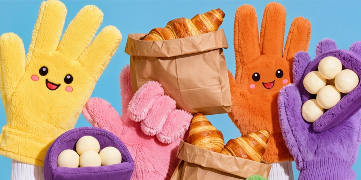
Egg White was built on a simple and increasingly radical premise: food packaging should show you where the food comes from, not hide it behind a photograph of a countryside it has never seen. The brief was to design a container that made the connection between chicken and egg not just visible, but unavoidable. The solution was structural. A die-cut cardboard form in the shape of a hen — standing upright on terracotta feet, wings folded, comb in olive green — with the eggs nestled visibly inside the body cavity. The container is the story. There is no label required to explain the product because the product explains itself.
Egg White was built on a simple and increasingly radical premise: food packaging should show you where the food comes from, not hide it behind a photograph of a countryside it has never seen. The brief was to design a container that made the connection between chicken and egg not just visible, but unavoidable. The solution was structural. A die-cut cardboard form in the shape of a hen — standing upright on terracotta feet, wings folded, comb in olive green — with the eggs nestled visibly inside the body cavity. The container is the story. There is no label required to explain the product because the product explains itself.
The color palette was extracted from the farmyard itself: off-white recycled card, olive green for the comb and wing details, terracotta for the beak and feet, and the warm amber of the eggs visible through the open body. Every color has a source. Nothing was chosen from a brand palette deck — it was observed and replicated. The structural design solves a functional problem too. The hen form cradles the eggs in a curved base that distributes weight evenly, protecting the contents while making it physically satisfying to carry. The handle — cut from the hen's back — is the most natural grip in the category. It was there all along.
The color palette was extracted from the farmyard itself: off-white recycled card, olive green for the comb and wing details, terracotta for the beak and feet, and the warm amber of the eggs visible through the open body. Every color has a source. Nothing was chosen from a brand palette deck — it was observed and replicated. The structural design solves a functional problem too. The hen form cradles the eggs in a curved base that distributes weight evenly, protecting the contents while making it physically satisfying to carry. The handle — cut from the hen's back — is the most natural grip in the category. It was there all along.


Turning a Cardboard Hen Into the Most Shared Piece of Grocery Packaging of the Year
Turning a Cardboard Hen Into the Most Shared Piece of Grocery Packaging of the Year
The packaging was designed to be kept. Unlike conventional egg cartons that go directly to recycling, the Egg White hen was engineered to be reusable as a countertop display, a children's toy or a small storage vessel. The brand's environmental credentials are embedded in the object's second life, not printed on its side as a claim. Retail buyers responded immediately to the structural concept. The packaging stands upright and faces forward on a shelf, occupying the same footprint as a conventional carton but generating ten times the visual presence. It does not sit in the refrigerated section. It commands it.
The packaging was designed to be kept. Unlike conventional egg cartons that go directly to recycling, the Egg White hen was engineered to be reusable as a countertop display, a children's toy or a small storage vessel. The brand's environmental credentials are embedded in the object's second life, not printed on its side as a claim. Retail buyers responded immediately to the structural concept. The packaging stands upright and faces forward on a shelf, occupying the same footprint as a conventional carton but generating ten times the visual presence. It does not sit in the refrigerated section. It commands it.
The packaging was designed to be kept. Unlike conventional egg cartons that go directly to recycling, the Egg White hen was engineered to be reusable as a countertop display, a children's toy or a small storage vessel. The brand's environmental credentials are embedded in the object's second life, not printed on its side as a claim. Retail buyers responded immediately to the structural concept. The packaging stands upright and faces forward on a shelf, occupying the same footprint as a conventional carton but generating ten times the visual presence. It does not sit in the refrigerated section. It commands it.
The illustration system was developed as a flat, graphic extension of the structural form — the same hen character reproduced across secondary packaging, recipe cards and branded paper bags in a reduced two-color version that works at any scale. The character is always the same hen, always standing, always with eggs visible inside her body. Consistency was the strategy. Social media adoption was entirely organic. Customers photographed the packaging before opening it, posted it as an object of curiosity and tagged the brand without prompting. The hen became a social media asset that the brand never had to produce itself — the packaging did the work, as all great packaging should.
The illustration system was developed as a flat, graphic extension of the structural form — the same hen character reproduced across secondary packaging, recipe cards and branded paper bags in a reduced two-color version that works at any scale. The character is always the same hen, always standing, always with eggs visible inside her body. Consistency was the strategy. Social media adoption was entirely organic. Customers photographed the packaging before opening it, posted it as an object of curiosity and tagged the brand without prompting. The hen became a social media asset that the brand never had to produce itself — the packaging did the work, as all great packaging should.
The illustration system was developed as a flat, graphic extension of the structural form — the same hen character reproduced across secondary packaging, recipe cards and branded paper bags in a reduced two-color version that works at any scale. The character is always the same hen, always standing, always with eggs visible inside her body. Consistency was the strategy. Social media adoption was entirely organic. Customers photographed the packaging before opening it, posted it as an object of curiosity and tagged the brand without prompting. The hen became a social media asset that the brand never had to produce itself — the packaging did the work, as all great packaging should.

•
Feedback

“They quickly understood what we were trying to achieve and translated it into something even better than we imagined. The collaboration felt natural and the outcome speaks for itself.”
Annelies de Groot
Founder, Egg White
“They quickly understood what we were trying to achieve and translated it into something even better than we imagined. The collaboration felt natural and the outcome speaks for itself.”
Annelies de Groot
Founder, Egg White
•
Feedback
“They quickly understood what we were trying to achieve and translated it into something even better than we imagined. The collaboration felt natural and the outcome speaks for itself.”
Annelies de Groot
Founder, Egg White
Wanna See More?
Wanna See More?
Wanna See More?