Work
Year
Year
2026
2026
Client
Client
Velour Peach
Velour Peach
Japanese flavors, delivered to your door.
Duration
Duration
5 months
5 months
Location
Location
Paris, FR
Paris, FR
Industry
Industry
Food & Beverage
Food & Beverage
Deliverables
Deliverables
Brand identity, packaging design, illustration system, copywriting, and brand guidelines.
Brand identity, packaging design, illustration system, copywriting, and brand guidelines.
Pāru Pāru is a Japanese snack delivery brand built for the French market. What began as a curated snack box concept grew into a full brand identity — playful, sticker-covered and rooted in the joy of discovering Japanese flavors from your own kitchen.
Pāru Pāru is a Japanese snack delivery brand built for the French market. What began as a curated snack box concept grew into a full brand identity — playful, sticker-covered and rooted in the joy of discovering Japanese flavors from your own kitchen.

Creating a Packaging Identity That Feels Like Opening a Gift Every Time
Creating a Packaging Identity That Feels Like Opening a Gift Every Time
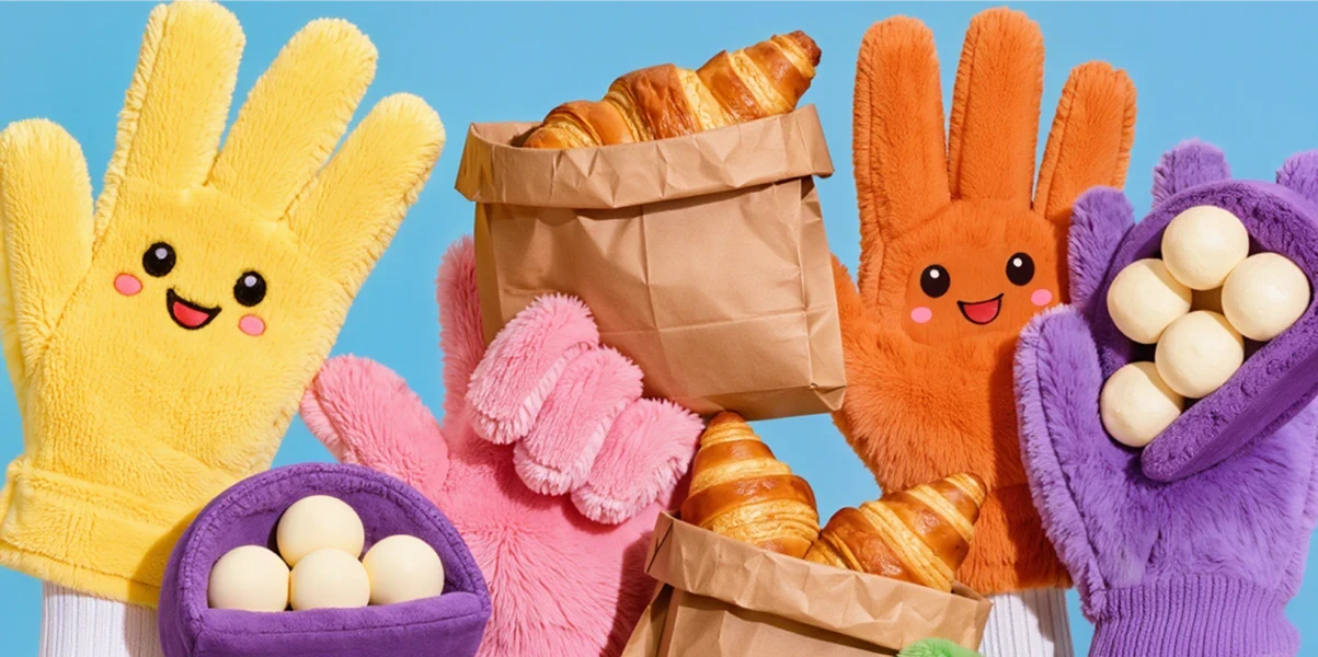
Pāru Pāru was built around the unboxing moment. The brief was clear: the packaging needed to feel like something a friend sent you from Tokyo, not a subscription box from a warehouse. Every design decision was made to maximize that sense of discovery and delight. The kraft paper bag became the hero. Its natural texture was left intentionally raw, acting as a canvas for a sticker universe — characters, badges, icons and typographic patches that reward attention and change with every collection drop.
Pāru Pāru was built around the unboxing moment. The brief was clear: the packaging needed to feel like something a friend sent you from Tokyo, not a subscription box from a warehouse. Every design decision was made to maximize that sense of discovery and delight. The kraft paper bag became the hero. Its natural texture was left intentionally raw, acting as a canvas for a sticker universe — characters, badges, icons and typographic patches that reward attention and change with every collection drop.
The French copy was set in a condensed, heavy typeface that fills the entire bag face — loud, confident and impossible to miss. The contrast between the raw paper, the dark burgundy type and the explosion of illustrated stickers creates a visual personality that sits between Japanese convenience store culture and Parisian street energy. The result is packaging that travels. Customers photograph it, post it and keep the bag long after the snacks are gone. That was always the goal — to make the container as memorable as the contents.
The French copy was set in a condensed, heavy typeface that fills the entire bag face — loud, confident and impossible to miss. The contrast between the raw paper, the dark burgundy type and the explosion of illustrated stickers creates a visual personality that sits between Japanese convenience store culture and Parisian street energy. The result is packaging that travels. Customers photograph it, post it and keep the bag long after the snacks are gone. That was always the goal — to make the container as memorable as the contents.


Building a Sticker Universe as the Core of the Brand Identity
Building a Sticker Universe as the Core of the Brand Identity
The illustration system was developed as a modular sticker collection — each character and badge designed to work independently or as part of a chaotic, joyful composition. The cast includes a round pug warrior, a blue cat mascot and a series of food-themed icons, all drawn in a style that references both Japanese kawaii culture and Western trading card nostalgia. This system was designed to grow. New characters and badges can be introduced with each seasonal collection, keeping the packaging fresh without ever breaking the visual language.
The illustration system was developed as a modular sticker collection — each character and badge designed to work independently or as part of a chaotic, joyful composition. The cast includes a round pug warrior, a blue cat mascot and a series of food-themed icons, all drawn in a style that references both Japanese kawaii culture and Western trading card nostalgia. This system was designed to grow. New characters and badges can be introduced with each seasonal collection, keeping the packaging fresh without ever breaking the visual language.
The illustration system was developed as a modular sticker collection — each character and badge designed to work independently or as part of a chaotic, joyful composition. The cast includes a round pug warrior, a blue cat mascot and a series of food-themed icons, all drawn in a style that references both Japanese kawaii culture and Western trading card nostalgia. This system was designed to grow. New characters and badges can be introduced with each seasonal collection, keeping the packaging fresh without ever breaking the visual language.
The Pāru Pāru logotype was crafted to work bilingually — the Japanese katakana and the romanized version sitting together with equal weight. This duality is central to the brand: it is a Japanese product made accessible to a French audience, and the identity reflects that bridge rather than hiding it. Color was kept deliberately warm and playful. The hot pink background, peach bag and burgundy type palette avoids the usual red-and-white codes of Japanese food branding, carving out a space that feels genuinely original in the market.
The Pāru Pāru logotype was crafted to work bilingually — the Japanese katakana and the romanized version sitting together with equal weight. This duality is central to the brand: it is a Japanese product made accessible to a French audience, and the identity reflects that bridge rather than hiding it. Color was kept deliberately warm and playful. The hot pink background, peach bag and burgundy type palette avoids the usual red-and-white codes of Japanese food branding, carving out a space that feels genuinely original in the market.
The Pāru Pāru logotype was crafted to work bilingually — the Japanese katakana and the romanized version sitting together with equal weight. This duality is central to the brand: it is a Japanese product made accessible to a French audience, and the identity reflects that bridge rather than hiding it. Color was kept deliberately warm and playful. The hot pink background, peach bag and burgundy type palette avoids the usual red-and-white codes of Japanese food branding, carving out a space that feels genuinely original in the market.

•
Feedback

"We wanted the bag to feel like the best part of the delivery — and it does. People tag us constantly just because of the packaging. The team completely understood what we were going for and pushed it further than we imagined. The sticker system alone was worth the whole project."
Léa Fontaine
Co-founder, Pāru Pāru
•
Feedback
"We wanted the bag to feel like the best part of the delivery — and it does. People tag us constantly just because of the packaging. The team completely understood what we were going for and pushed it further than we imagined. The sticker system alone was worth the whole project."
Léa Fontaine
Co-founder, Pāru Pāru
Wanna See More?
Wanna See More?
Wanna See More?