Work
Year
Year
2026
2026
Client
Client
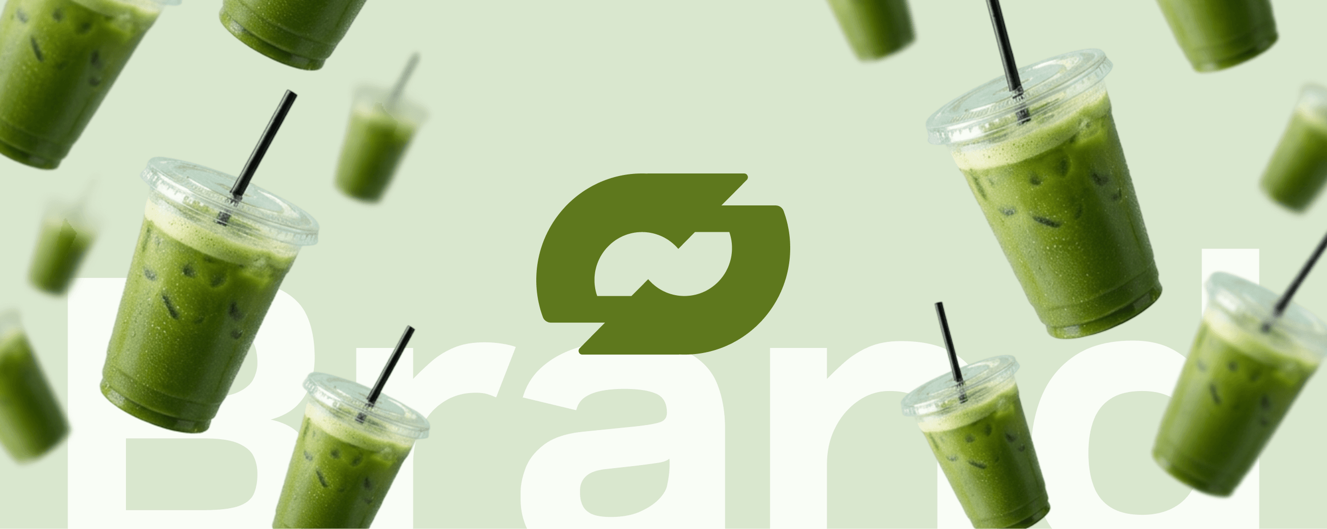
Verdant
Verdant
Always room for one more.
Duration
Duration
4 months
4 months
Location
Location
Tokyo, JP
Tokyo, JP
Industry
Industry
Food & Beverage
Food & Beverage
Deliverables
Deliverables
Brand identity, social media direction, content strategy, art direction, merchandise design, and brand guidelines.
Brand identity, social media direction, content strategy, art direction, merchandise design, and brand guidelines.
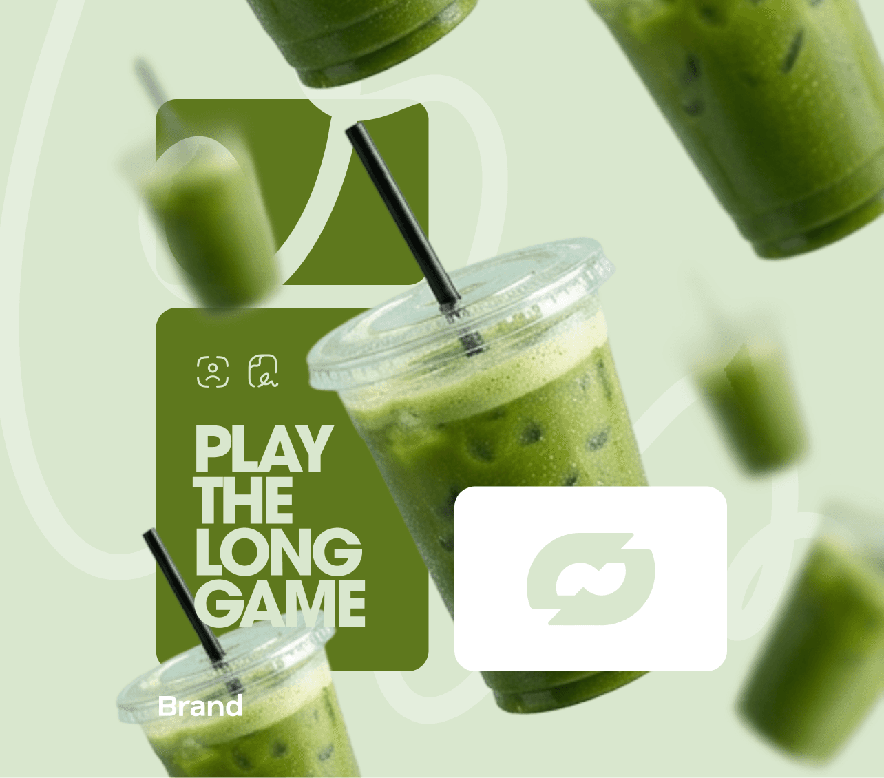
Some More is a matcha beverage brand built for the mobile-first generation. What started as a single drink concept grew into a full social media identity and lifestyle brand — calm, textured and rooted in the quiet satisfaction of wanting just one more sip.
Some More is a matcha beverage brand built for the mobile-first generation. What started as a single drink concept grew into a full social media identity and lifestyle brand — calm, textured and rooted in the quiet satisfaction of wanting just one more sip.
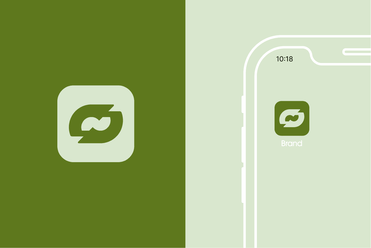
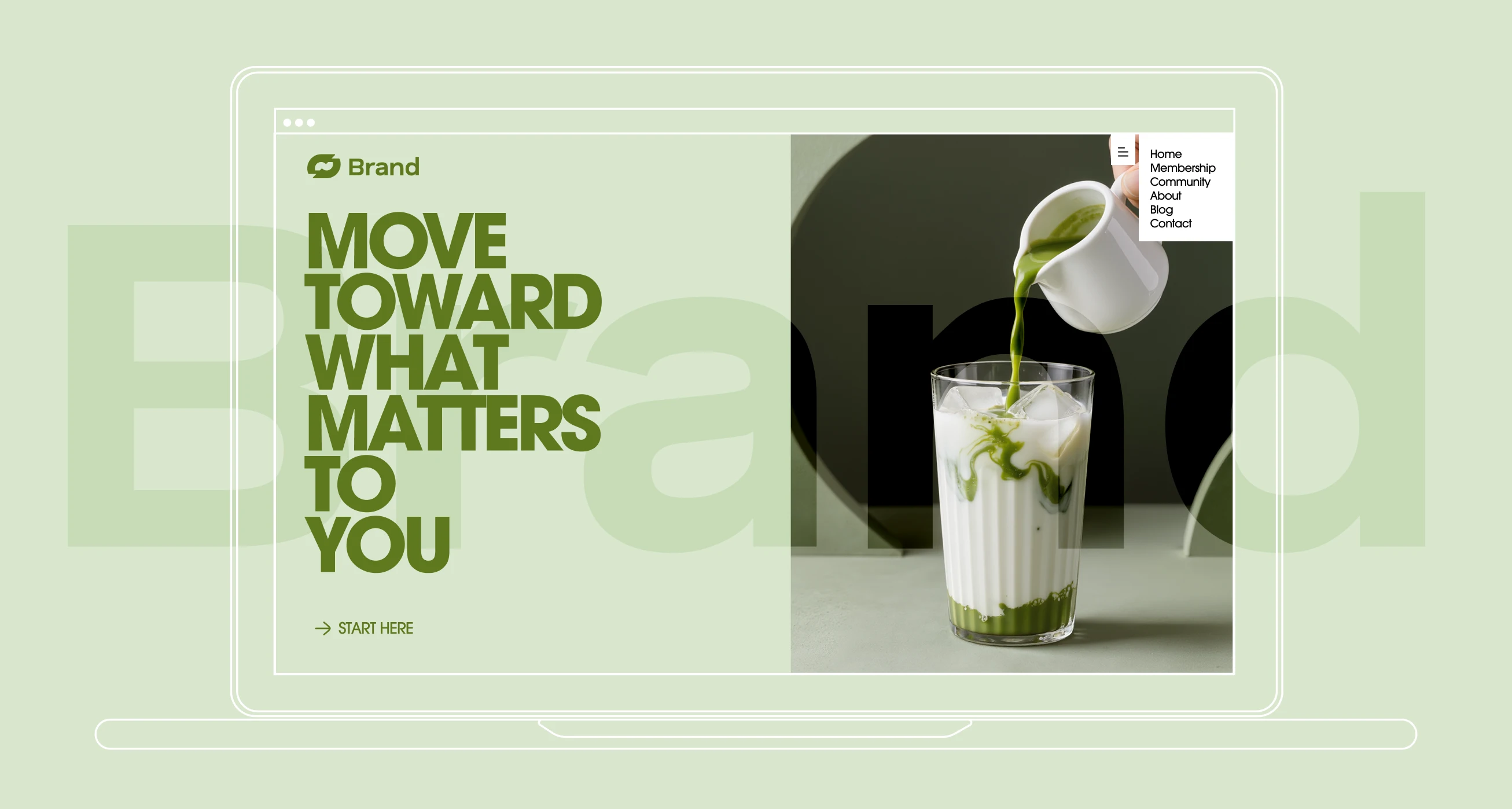
Crafting a Social-First Brand Identity for a Matcha Brand That Lives on the Phone Screen
Crafting a Social-First Brand Identity for a Matcha Brand That Lives on the Phone Screen
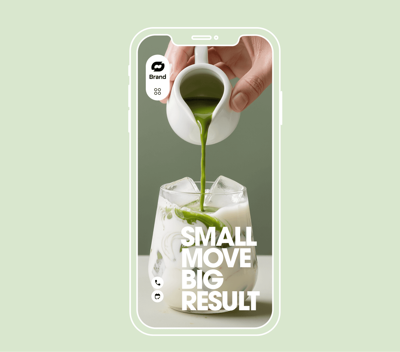
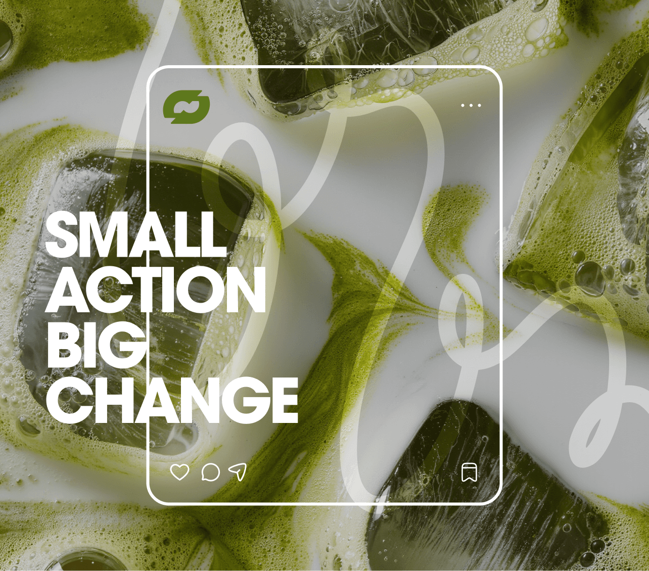
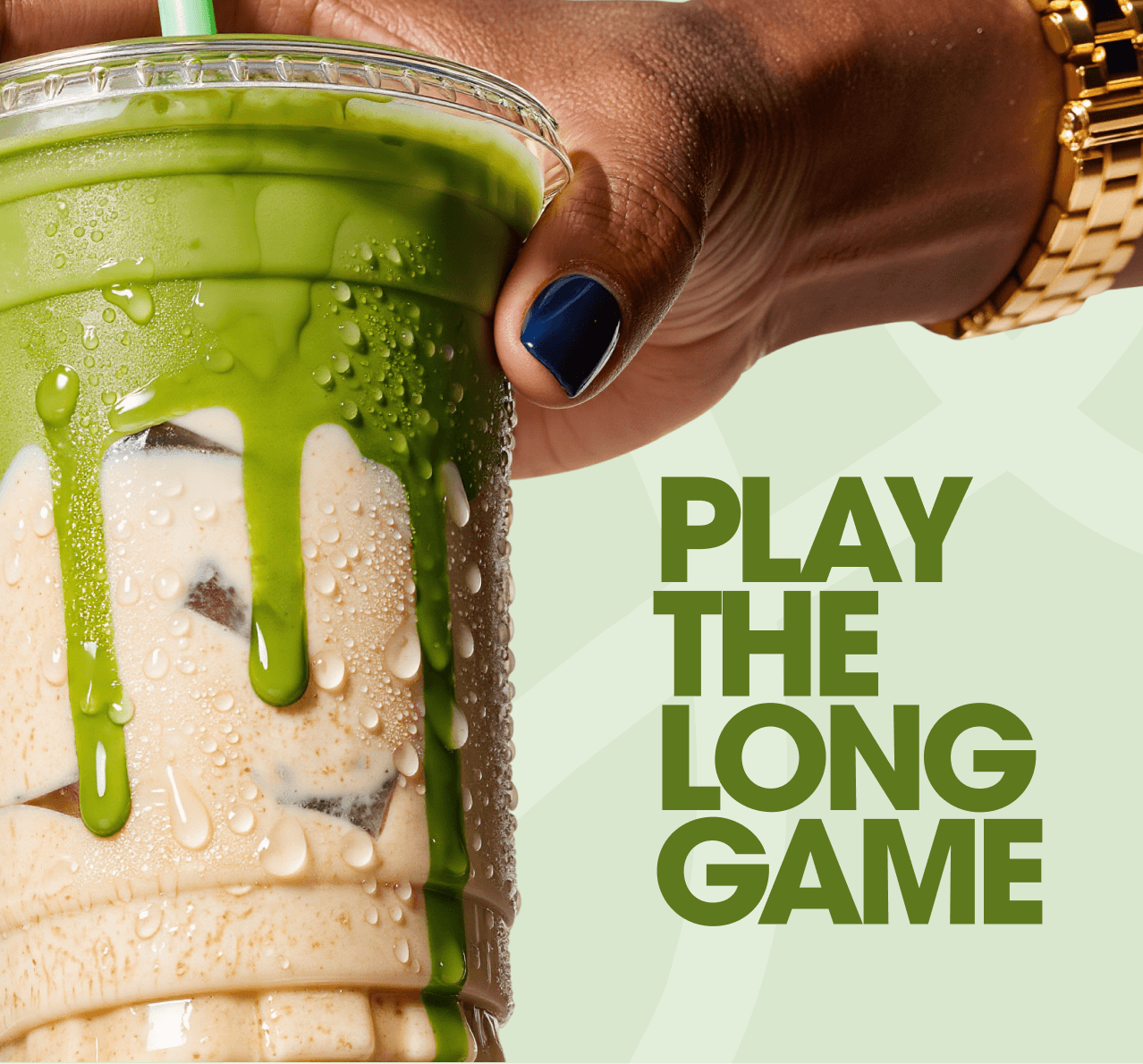
Some More was designed from the screen outward. The brand's primary touchpoint is not a storefront or a package — it is a feed. Every visual decision was made with the mobile frame in mind, treating each post as a self-contained world that holds up in isolation and builds into something coherent at scale. The content system was built around three visual modes: macro nature details that establish mood, product shots layered with collage and botanical texture, and lifestyle objects that extend the brand beyond the cup. Together they create a feed that breathes.
Some More was designed from the screen outward. The brand's primary touchpoint is not a storefront or a package — it is a feed. Every visual decision was made with the mobile frame in mind, treating each post as a self-contained world that holds up in isolation and builds into something coherent at scale. The content system was built around three visual modes: macro nature details that establish mood, product shots layered with collage and botanical texture, and lifestyle objects that extend the brand beyond the cup. Together they create a feed that breathes.
The sage and matcha green palette was extracted from the drink itself and carried across every surface — background environments, cup branding, merchandise and the mobile frames used in campaign imagery. The result is a brand that camouflages into its own world rather than standing apart from it. The collage treatment on the product shot — torn paper edges, overlapping botanical photography, architectural line fragments — gives the imagery an analog warmth that contrasts with the precision of a perfectly made matcha. It signals craft without being precious about it.
The sage and matcha green palette was extracted from the drink itself and carried across every surface — background environments, cup branding, merchandise and the mobile frames used in campaign imagery. The result is a brand that camouflages into its own world rather than standing apart from it. The collage treatment on the product shot — torn paper edges, overlapping botanical photography, architectural line fragments — gives the imagery an analog warmth that contrasts with the precision of a perfectly made matcha. It signals craft without being precious about it.
Turning a Tote Bag Into a Brand Statement and a Social Media Asset at Once
Turning a Tote Bag Into a Brand Statement and a Social Media Asset at Once
The Some More merchandise strategy was built around objects people would actually carry. The dark tote with stencil-printed wordmark was designed to function in the real world and in a flat-lay shot with equal ease. It is the kind of object that makes a brand feel like a subculture rather than a product. The stencil lettering — bold, slightly imperfect and printed white on forest green canvas — carries the same casual confidence as the brand voice. It reads as something found rather than designed, which is precisely the effect it was meant to create.
The Some More merchandise strategy was built around objects people would actually carry. The dark tote with stencil-printed wordmark was designed to function in the real world and in a flat-lay shot with equal ease. It is the kind of object that makes a brand feel like a subculture rather than a product. The stencil lettering — bold, slightly imperfect and printed white on forest green canvas — carries the same casual confidence as the brand voice. It reads as something found rather than designed, which is precisely the effect it was meant to create.
The Some More merchandise strategy was built around objects people would actually carry. The dark tote with stencil-printed wordmark was designed to function in the real world and in a flat-lay shot with equal ease. It is the kind of object that makes a brand feel like a subculture rather than a product. The stencil lettering — bold, slightly imperfect and printed white on forest green canvas — carries the same casual confidence as the brand voice. It reads as something found rather than designed, which is precisely the effect it was meant to create.
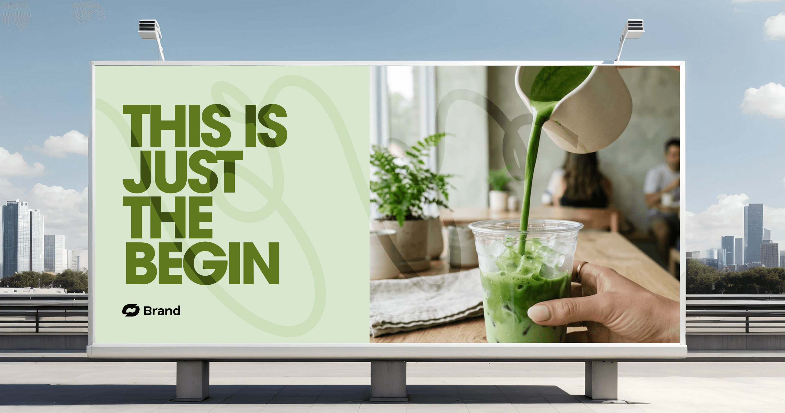
The social media direction established clear rules for how content is cropped, layered and sequenced. No white backgrounds. No studio-clean shots. Every image lives in a world of texture, light and organic material that reinforces the brand's connection to nature and slowness. The phone frame device — used throughout campaign materials — was developed to let the brand reference its own context. Showing content inside a phone outline is a way of saying: this was made for here. It acknowledges the medium without apologizing for it.
The social media direction established clear rules for how content is cropped, layered and sequenced. No white backgrounds. No studio-clean shots. Every image lives in a world of texture, light and organic material that reinforces the brand's connection to nature and slowness. The phone frame device — used throughout campaign materials — was developed to let the brand reference its own context. Showing content inside a phone outline is a way of saying: this was made for here. It acknowledges the medium without apologizing for it.
The social media direction established clear rules for how content is cropped, layered and sequenced. No white backgrounds. No studio-clean shots. Every image lives in a world of texture, light and organic material that reinforces the brand's connection to nature and slowness. The phone frame device — used throughout campaign materials — was developed to let the brand reference its own context. Showing content inside a phone outline is a way of saying: this was made for here. It acknowledges the medium without apologizing for it.
•
Feedback

"We needed a visual world that felt as good as the drink tastes. The team understood that immediately. The feed direction they built gave us a language we could actually maintain — our in-house team picked it up in a week. The tote sold out before we even ran a single ad."
Yuki Tanaka
Creative Director, Some More
•
Feedback
"We needed a visual world that felt as good as the drink tastes. The team understood that immediately. The feed direction they built gave us a language we could actually maintain — our in-house team picked it up in a week. The tote sold out before we even ran a single ad."
Yuki Tanaka
Creative Director, Some More
Wanna See More?
Wanna See More?
Wanna See More?