Work
Year
Year
2025
2025
Client
Client
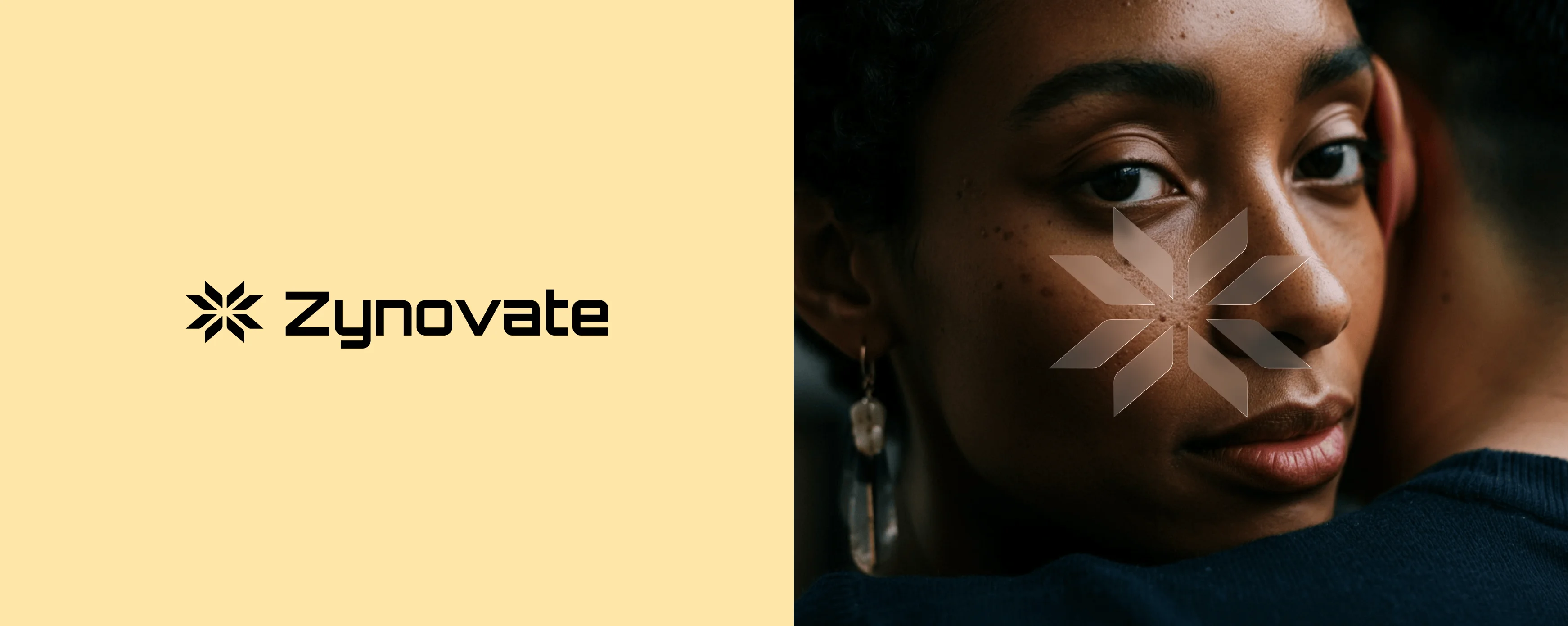
Zynovate
Zynovate
Intelligence with a human face.
Duration
Duration
4 months
4 months
Location
Location
San Francisco, US
San Francisco, US
Industry
Industry
Technology & Innovation
Technology & Innovation
Deliverables
Deliverables
Brand identity, logo design, brand mark system, art direction, photography direction, and brand guidelines.
Brand identity, logo design, brand mark system, art direction, photography direction, and brand guidelines.
Zynovate is a technology platform built to connect human insight with intelligent systems. What began as an internal tool for behavioral data analysis grew into a full brand identity — sharp, considered and designed to make a company operating at the edge of innovation feel as human as the people it serves.
Zynovate is a technology platform built to connect human insight with intelligent systems. What began as an internal tool for behavioral data analysis grew into a full brand identity — sharp, considered and designed to make a company operating at the edge of innovation feel as human as the people it serves.
Designing a Tech Brand Identity That Leads With People Instead of Product
Designing a Tech Brand Identity That Leads With People Instead of Product
Zynovate came to us with a platform that was technically sophisticated and visually invisible. The product worked. The brand did not yet exist in any meaningful sense — there was a name, a color and nothing else that communicated what the company believed or who it was built for. The strategy was to lead with humanity. In a category that defaults to abstract geometry, data visualizations and cold blue palettes, the most differentiated move was a face — close, direct and unguarded. A person looking back at you, not a system processing you.
Zynovate came to us with a platform that was technically sophisticated and visually invisible. The product worked. The brand did not yet exist in any meaningful sense — there was a name, a color and nothing else that communicated what the company believed or who it was built for. The strategy was to lead with humanity. In a category that defaults to abstract geometry, data visualizations and cold blue palettes, the most differentiated move was a face — close, direct and unguarded. A person looking back at you, not a system processing you.
The brand mark — a radial asterisk built from eight symmetrical arrow-like forms — was designed to suggest both network connectivity and human-centered focus simultaneously. Each arm points outward from a shared center, communicating expansion without losing the sense that everything originates from a single, clear point of intention. White on dark, always. The mark was engineered to hold its weight at any size — from a favicon at 16px to a full-wall installation — without losing the precision of its geometry. It is a logo that rewards close inspection while working instantly at a glance.
The brand mark — a radial asterisk built from eight symmetrical arrow-like forms — was designed to suggest both network connectivity and human-centered focus simultaneously. Each arm points outward from a shared center, communicating expansion without losing the sense that everything originates from a single, clear point of intention. White on dark, always. The mark was engineered to hold its weight at any size — from a favicon at 16px to a full-wall installation — without losing the precision of its geometry. It is a logo that rewards close inspection while working instantly at a glance.

Wanna See More?
Wanna See More?
Wanna See More?